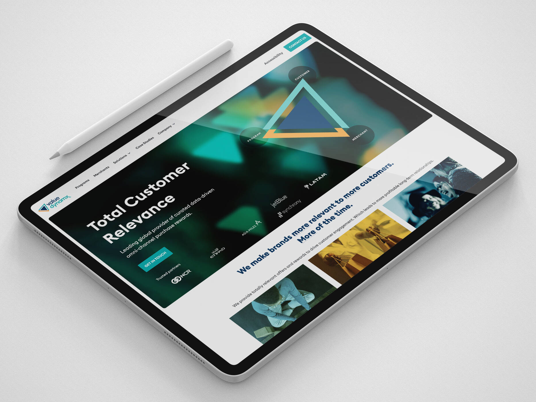
While over half of all web traffic now occurring through mobile devices, it would seem more important than ever for websites to be designed and fully optimised for smartphone or tablet viewing. However, despite usage skyrocketing, mobile and tablet device conversion rates are stuck at just 21% of all online revenue.
According to the Economist Intelligence Unit, 21% of people believe mobile devices take too long to process requests. 28% find the retailer’s site too difficult to make a purchase. Another 17% find retailer apps too confusing. Finally, a further 31% find they are concerned about data security.
So with this in mind – what can be done to ensure websites are inspiring real and long-term smartphone conversion?
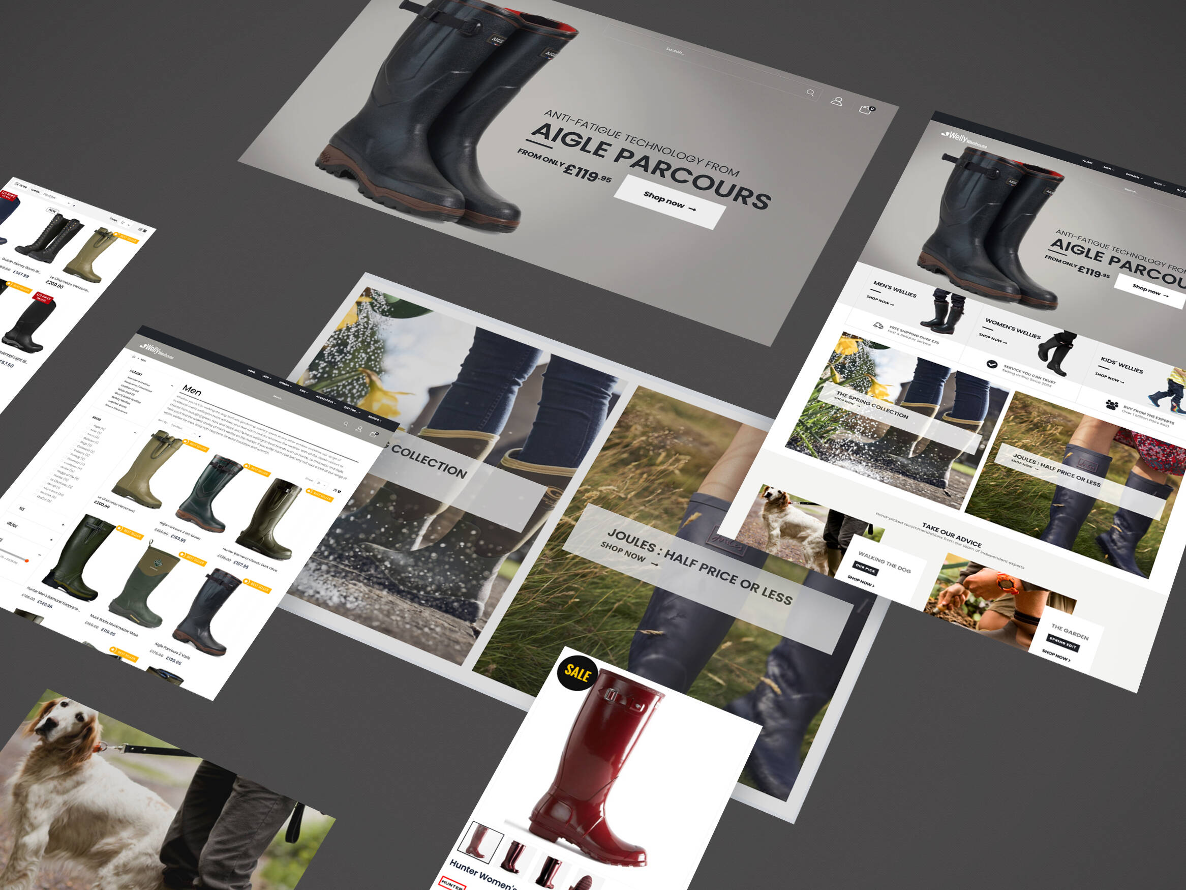
22 principles to inspire mobile website conversions
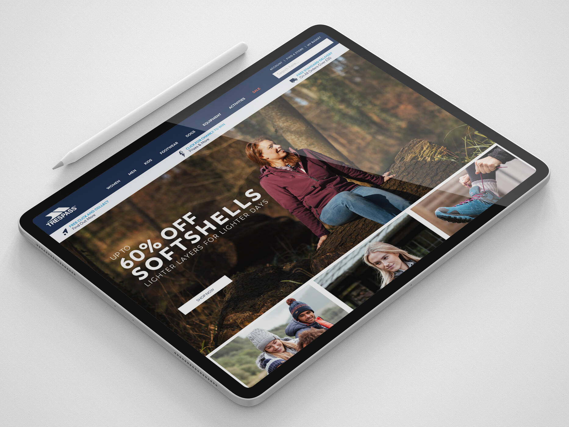
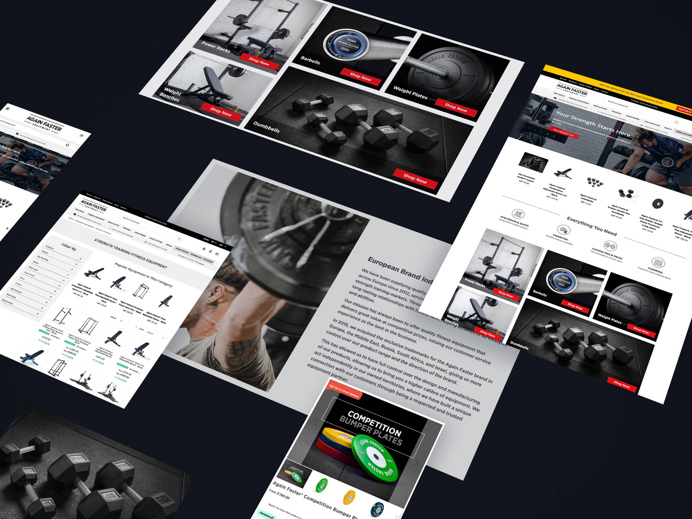
1. Have a call to action front and centre so that it’s easy for people to see.

2. Keep menus short and sweet.

3. Make it easy to return to the homepage, use your logo to link back.

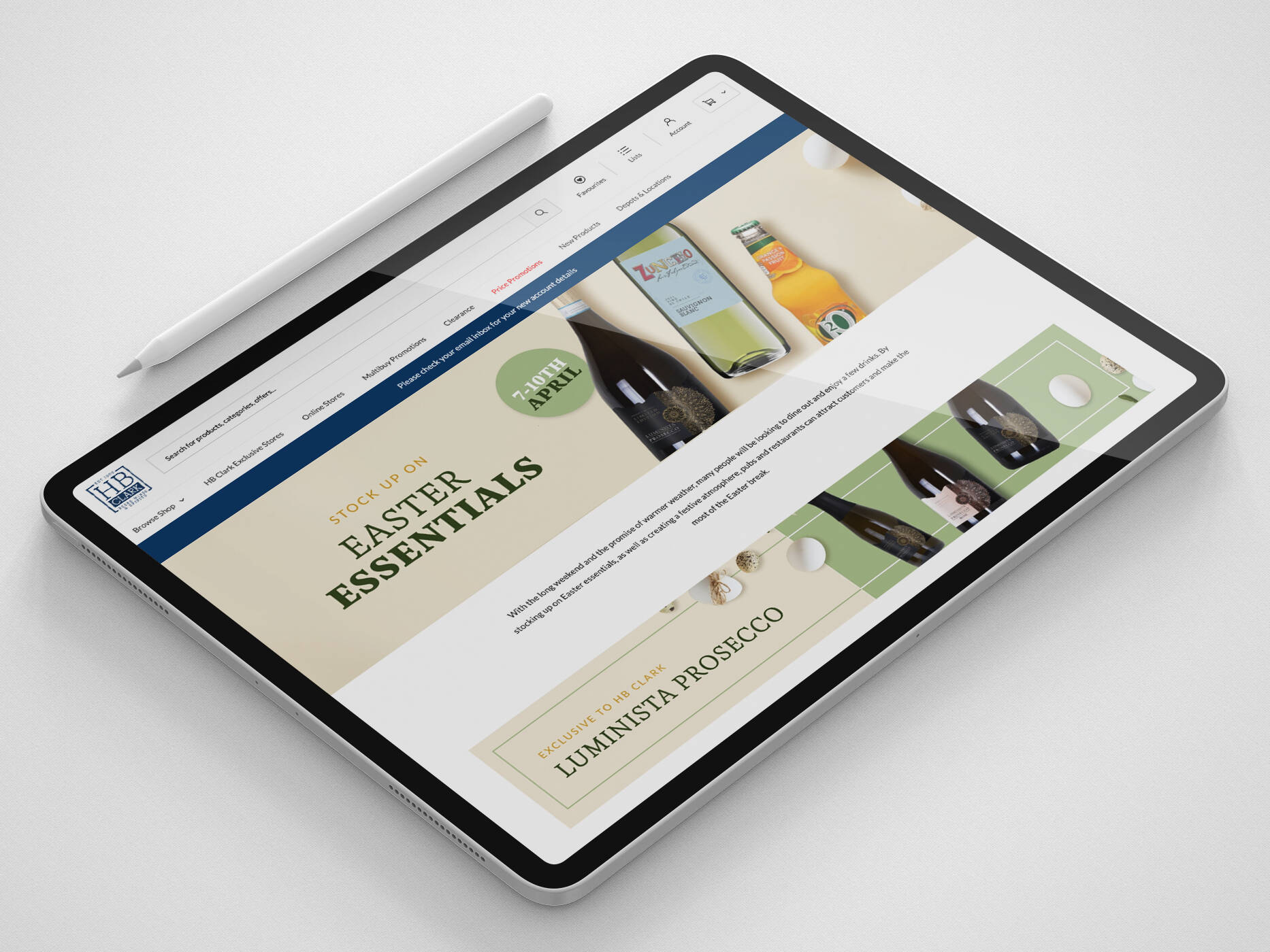
4. Don’t let promotions take over the homepage or interfere with navigation.

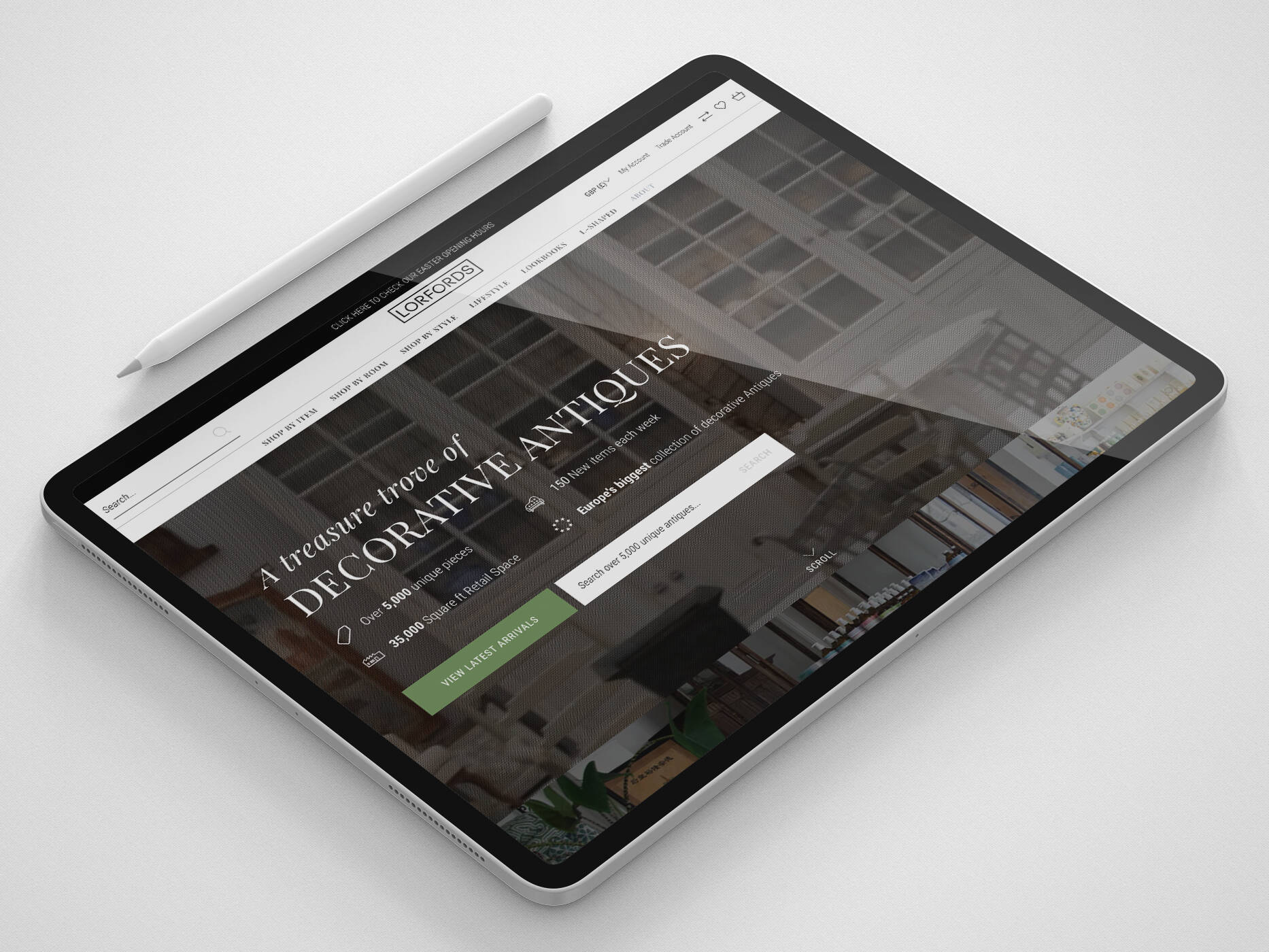
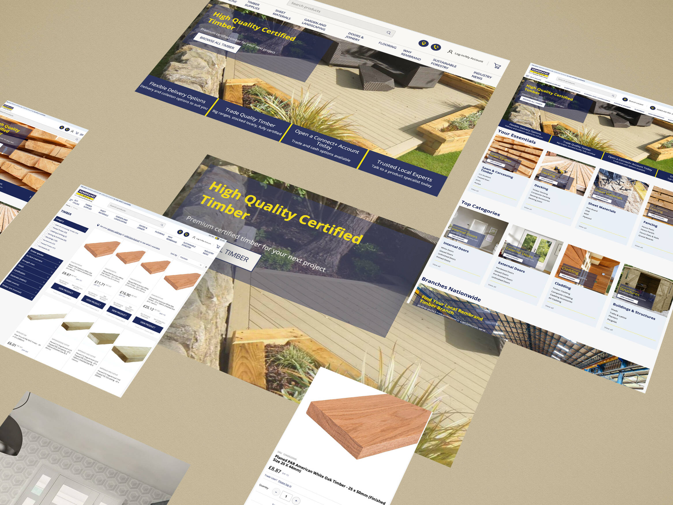
5. Make site search clearly visible on all pages.

6. Make site searches relevant so that users can find the information they need.

7. Include search filters to help users get accurate results.

8. Segment your search audience before they search, if possible.

9. Allow users to purchase as guests but encourage registration when possible.

10. Make it easy. Use registered users’ information by pre-filling their details.

11. Use click-to-call buttons so that users can speak to an operator if they need help.

12. Make it easy for a user to finish conversions on another device.

13. Offer users a number pad for field requiring number entry.

14. Choose the easiest ways for users to enter information, drop-downs, tick boxes etc

15. Make a visual calendar to make bookings and planning easy.

16. Use clear instructions and real-time validation to minimise errors, tell users when they have not entered the correct information.

17. Design of forms is important – short and easy to read is key.

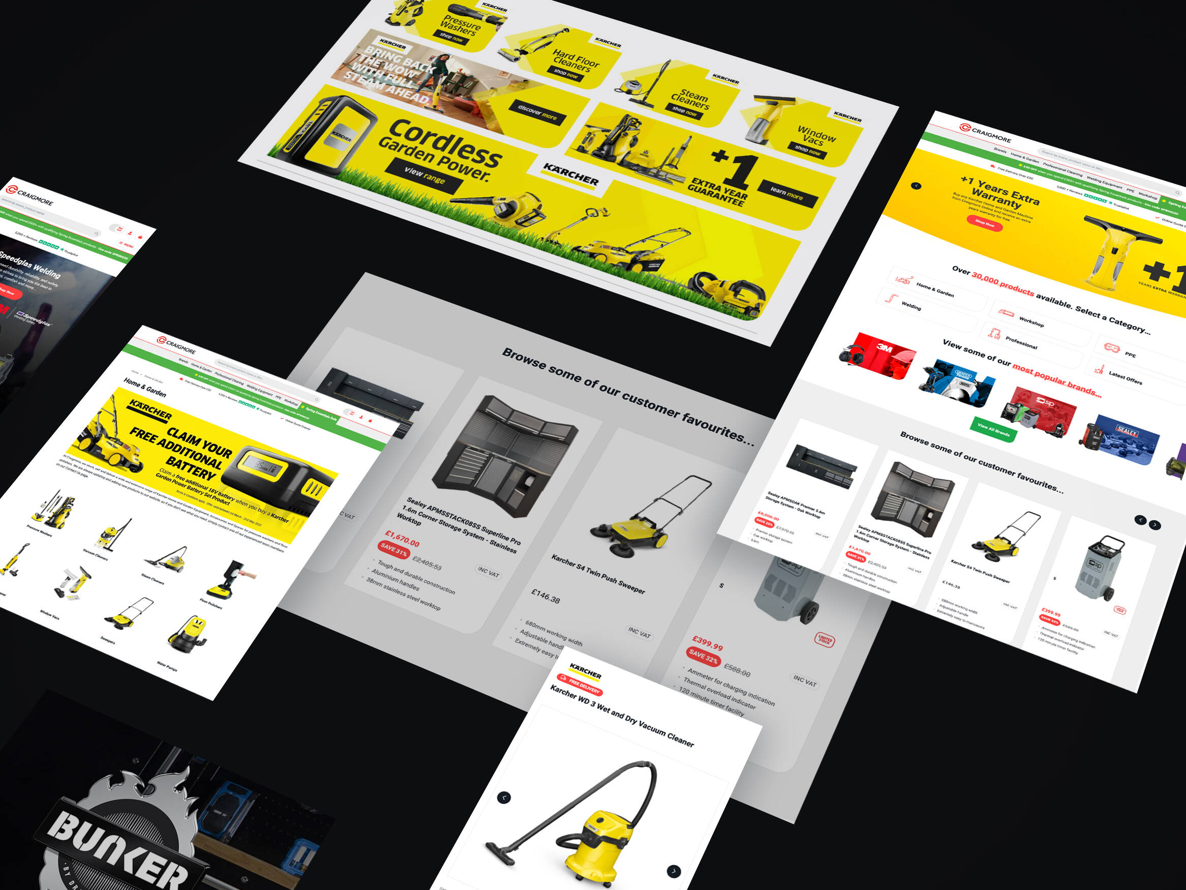
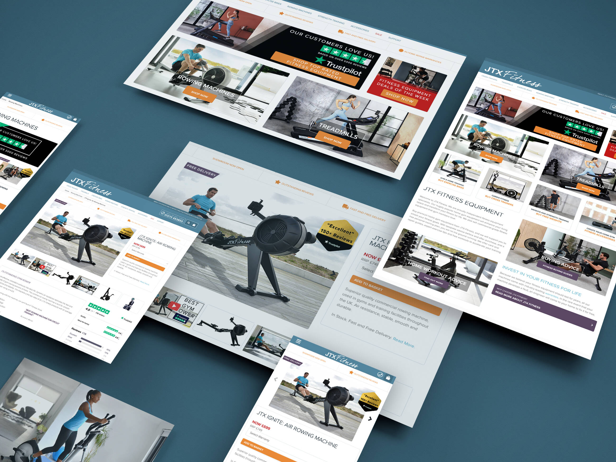
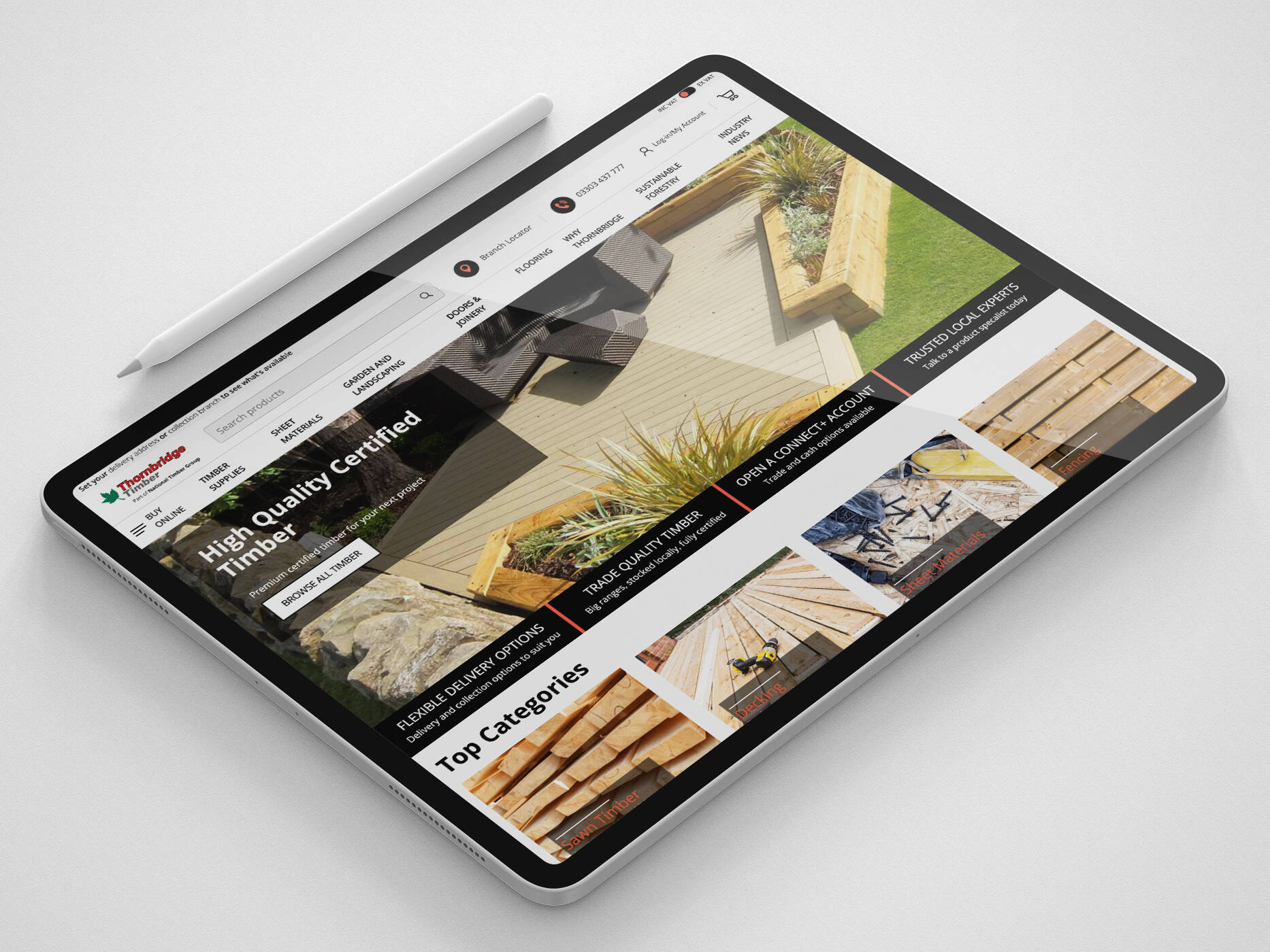
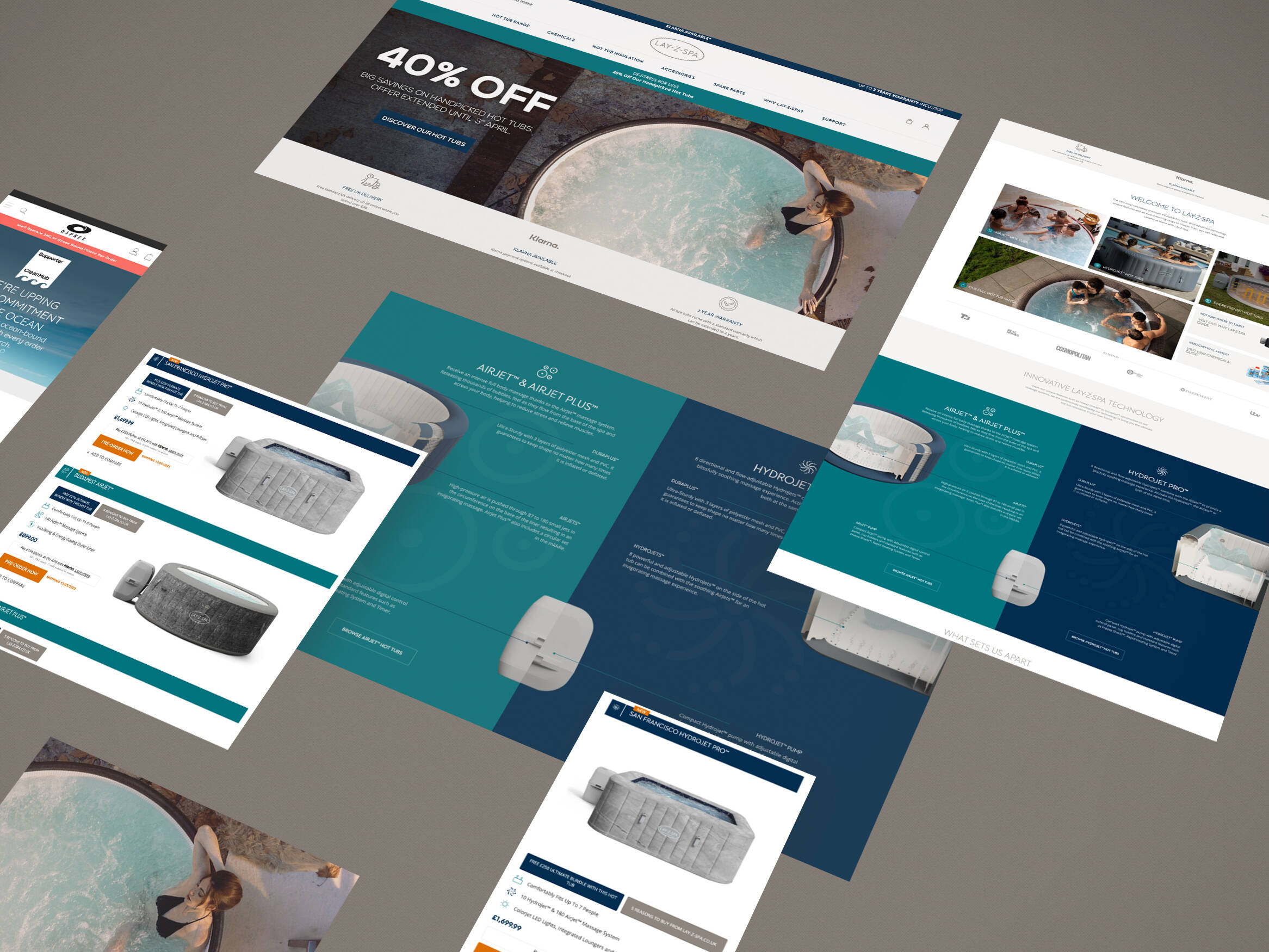
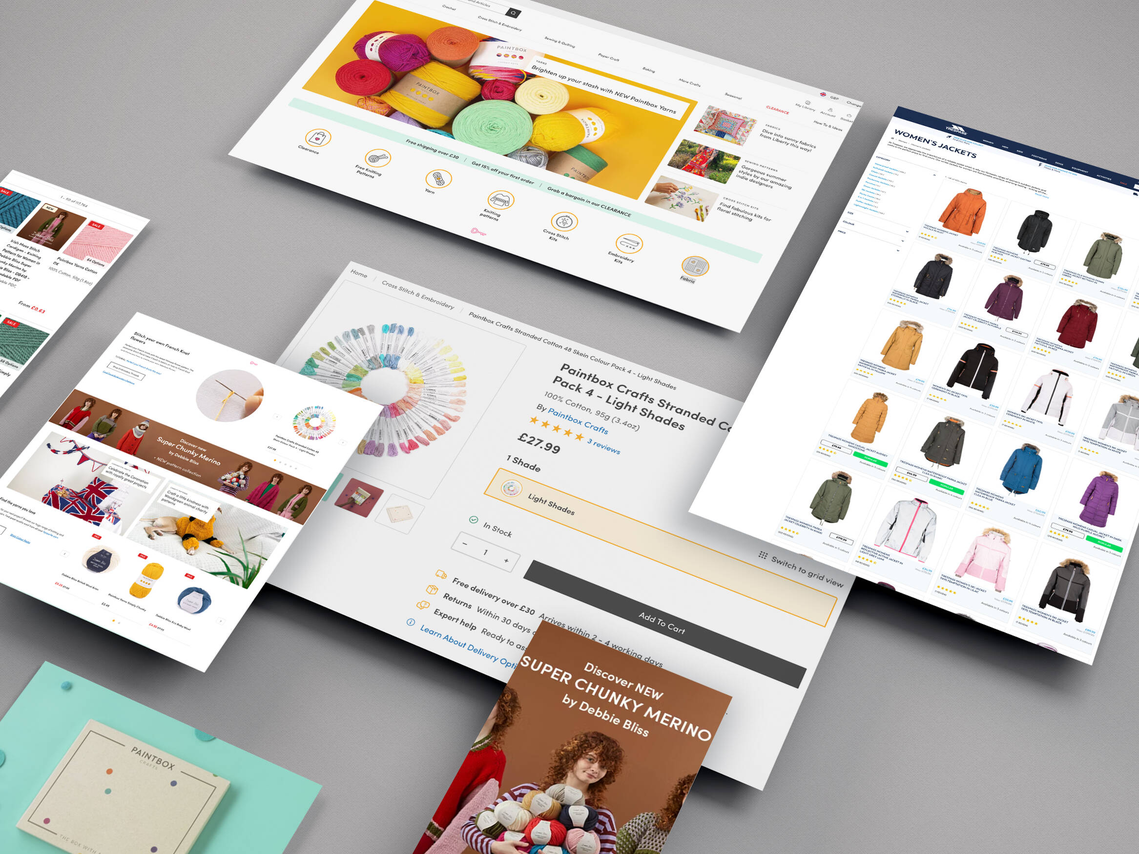
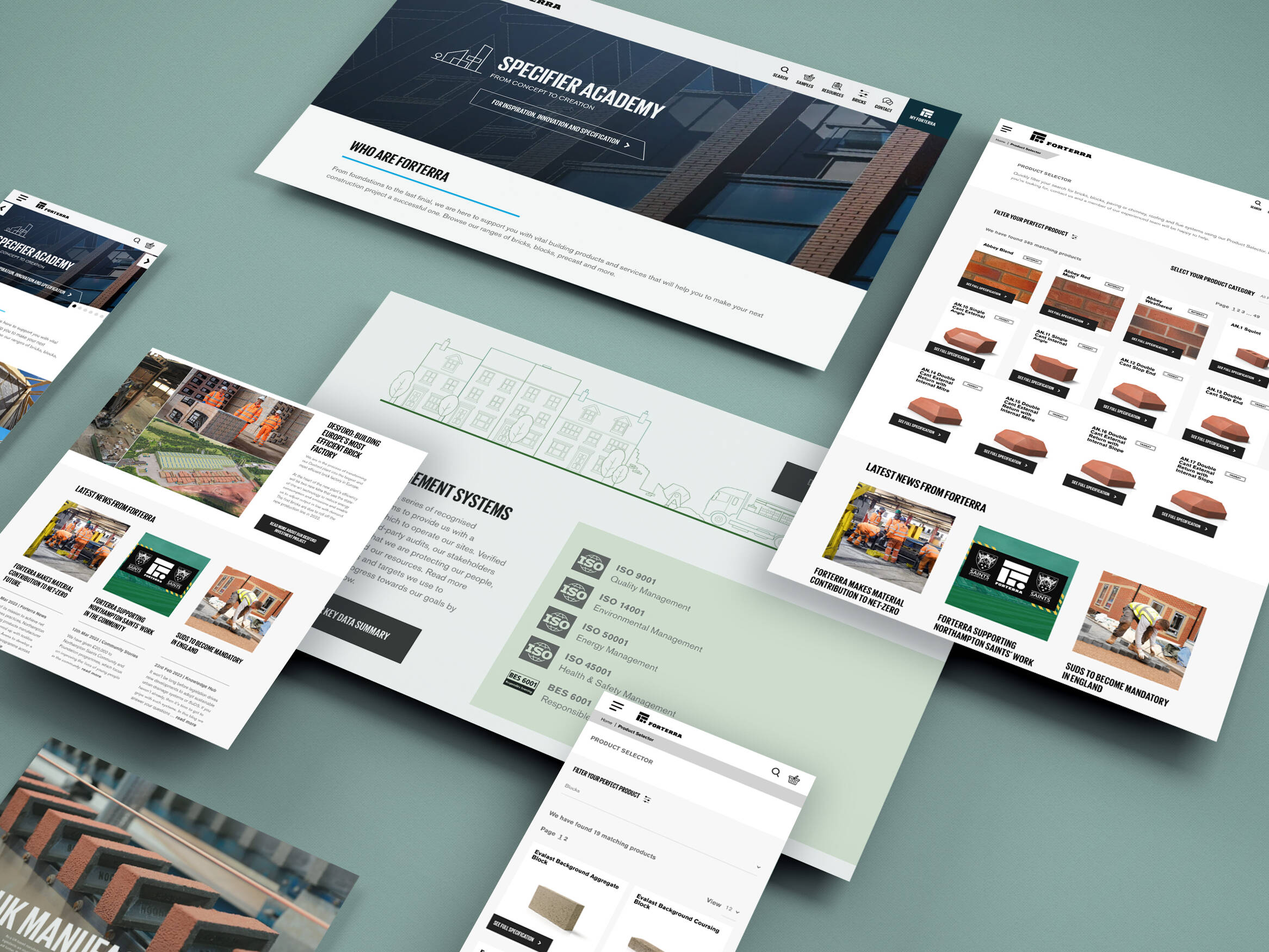
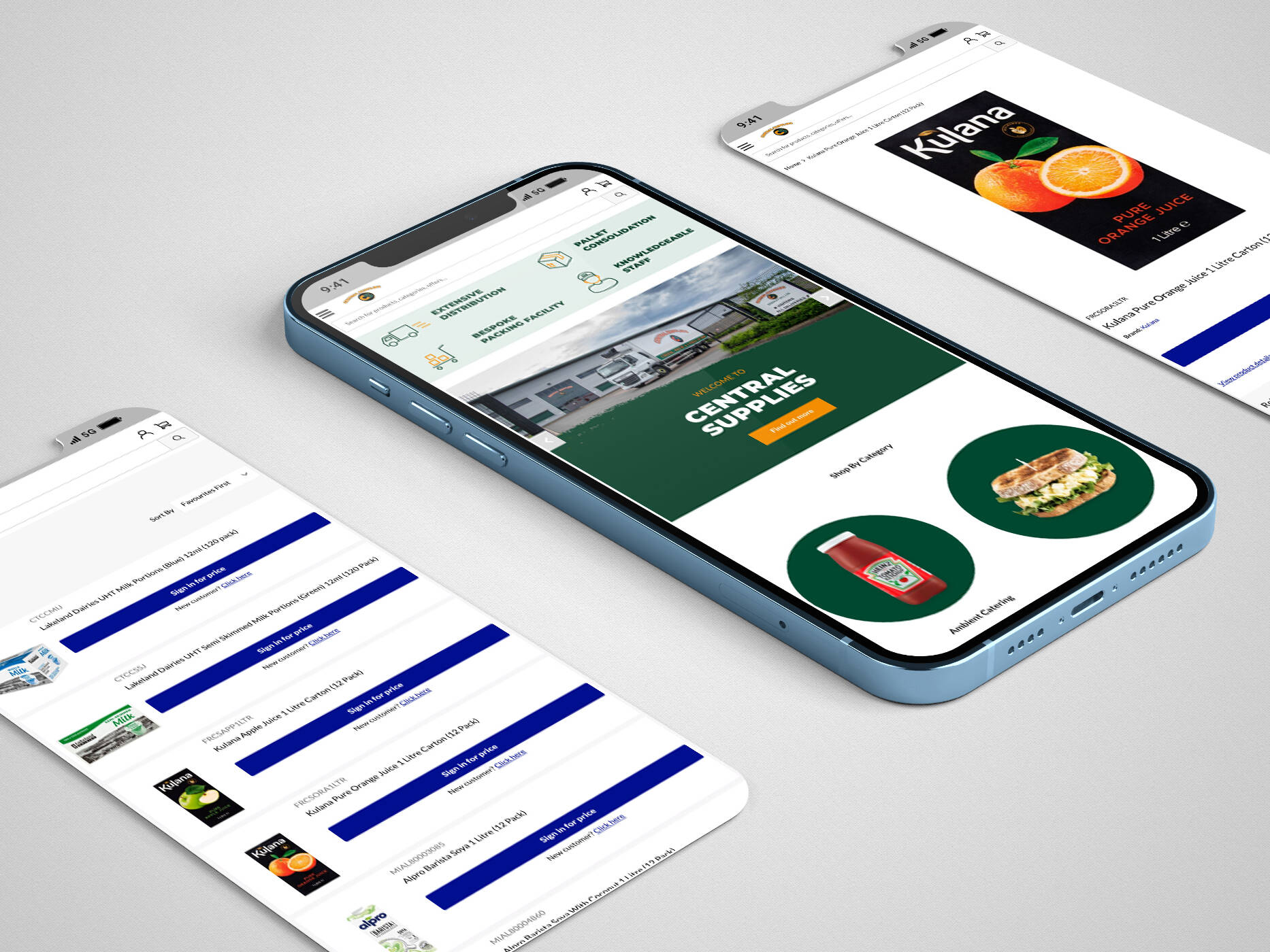
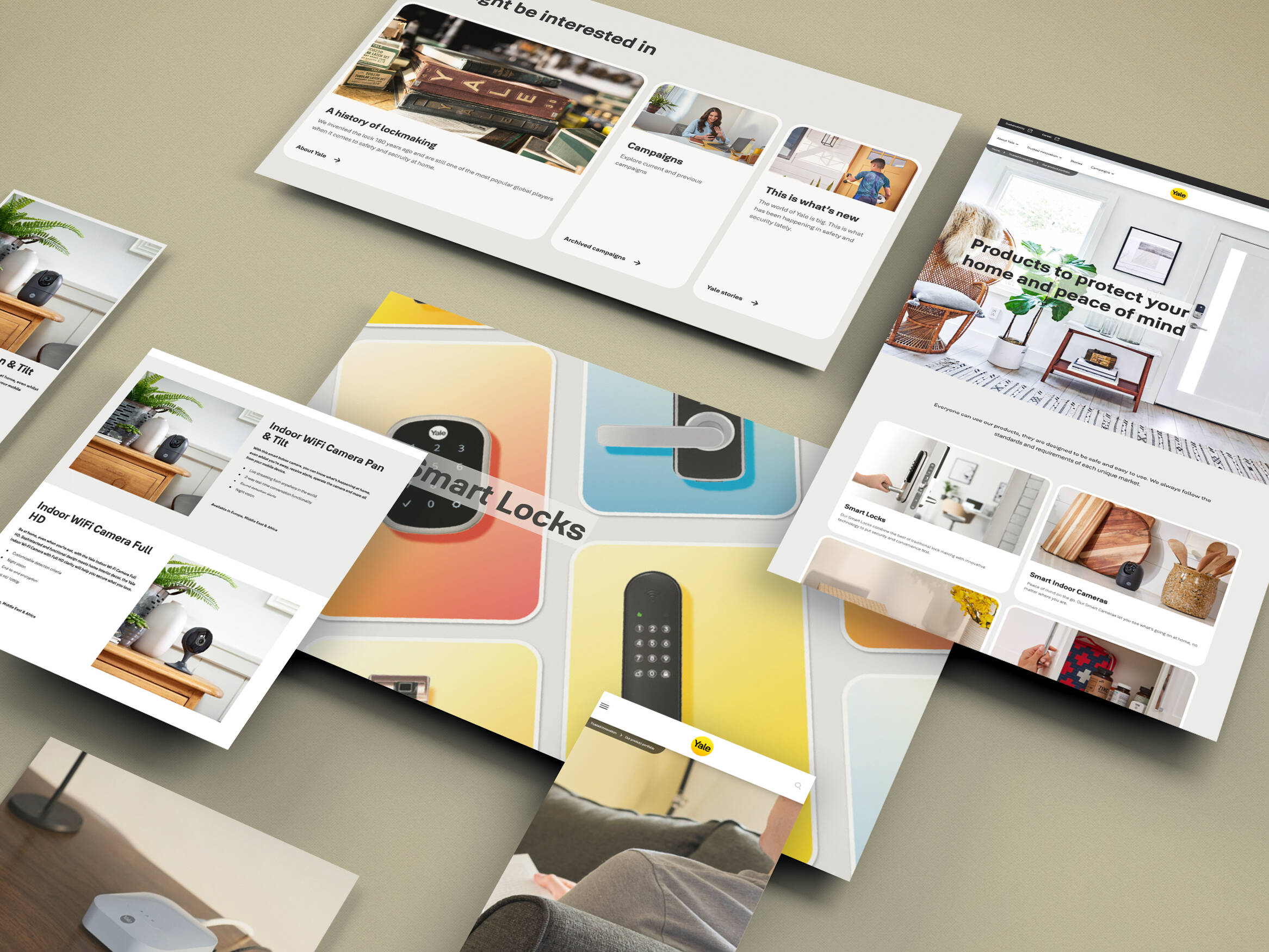
18. Design all your website pages so they are optimised for mobile.

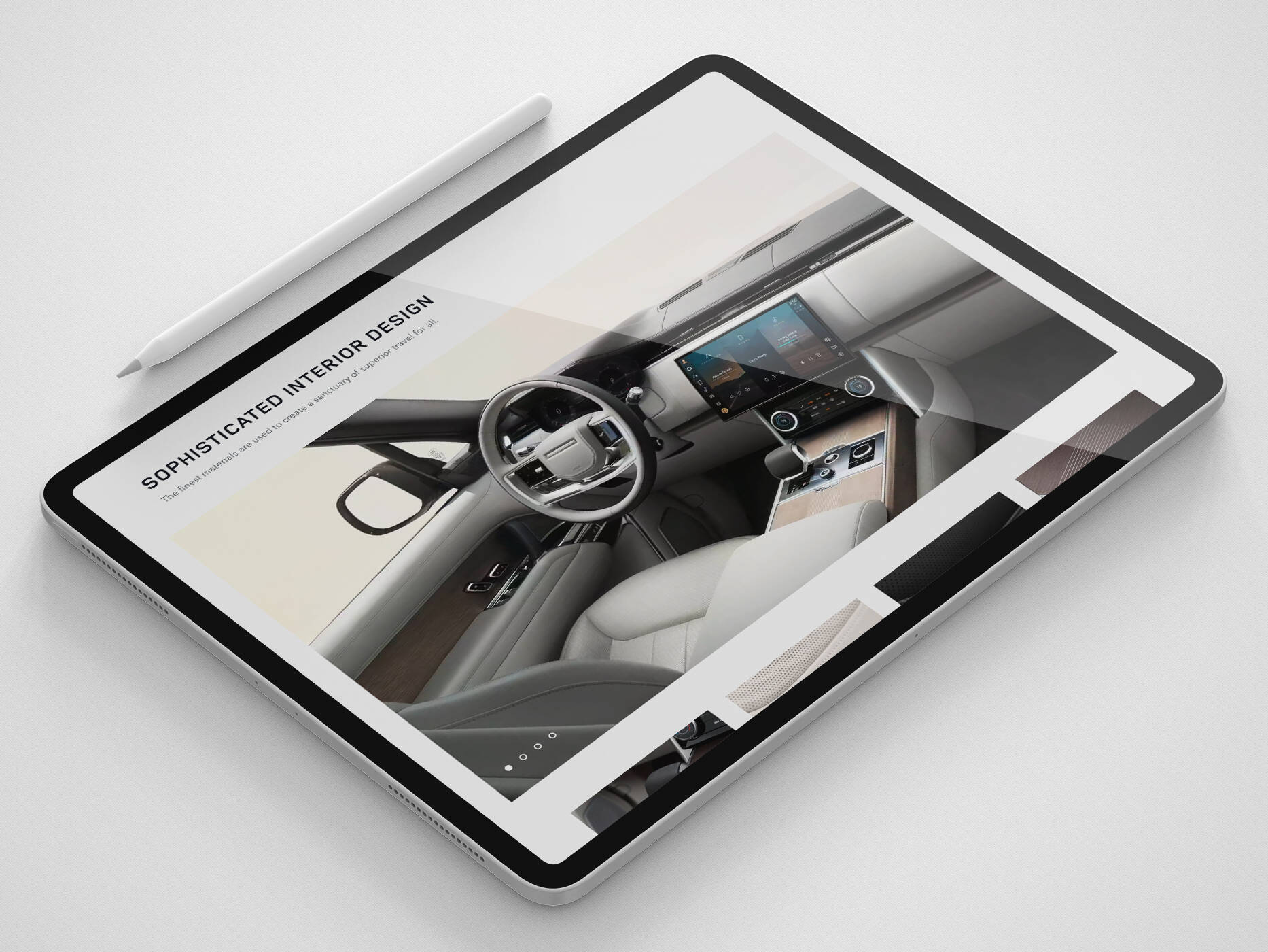
19. The images and layout should be legible.

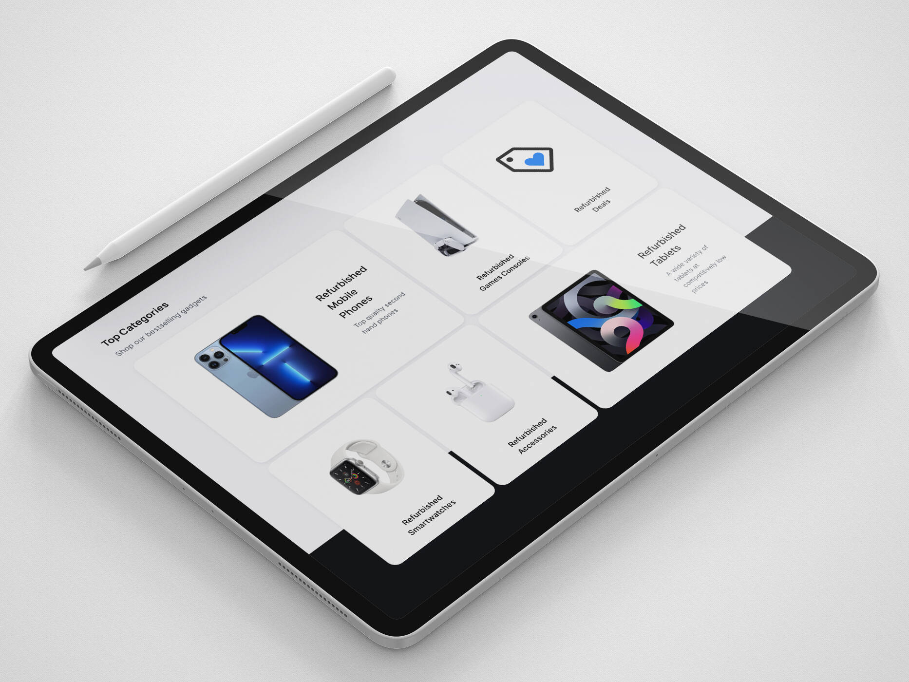
20. Include high-quality close-ups of key images and key products.

21. Tell users if your website is better viewed as portrait or landscape.


22. Allow the user to locate shops or products ‘near me’.

Want to learn more? Get in touch with us:
Get in touch
We know commerce, let us help you improve customer experience, increase conversion rates, and make that digital change.
- hello@iweb.co.uk