On Wednesday, April 5th, iWeb had the privilege of attending the first day of IRX17, at the NEC in Birmingham. As the biggest multichannel event in the UK, 90 leading experts, speakers and exhibitors were there to showcase to over 5000 industry visitors, the latest eCommerce and retail trends.
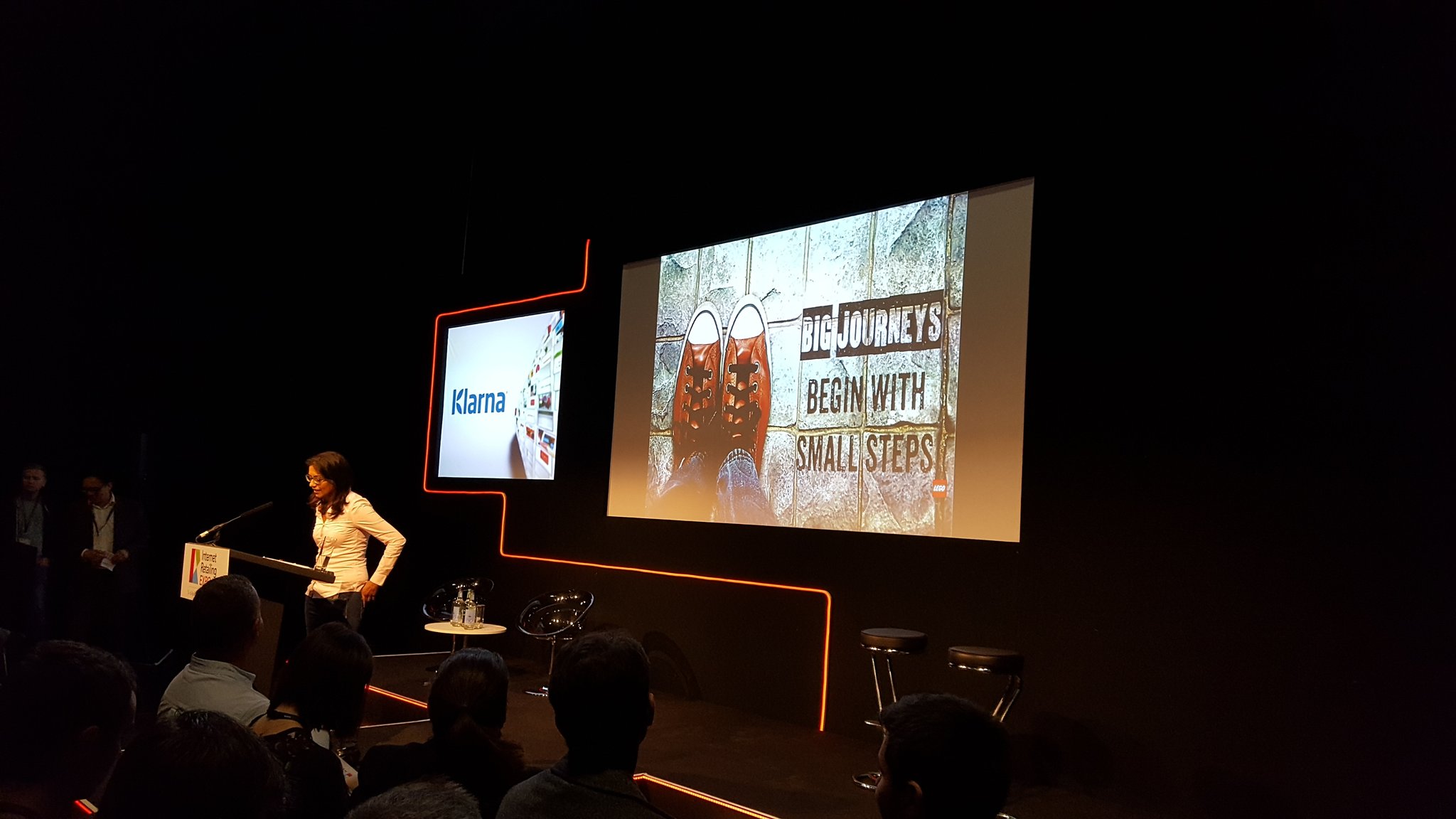
Amongst the speakers, we were lucky enough to listen to Shehnaaz Chenia, who has been Global eCommerce Director at The Lego Group, for the past four years. Within her speech, she outlined the Lego brand challenge that has consumed her and her team’s efforts for many months – the successful delivery of a seamless online to physical store shopping experience.
The Lego Strategy
The last ten years have seen Lego grow into nothing less than the Apple of toys: a profit-generating, design-driven brand built around premium, intuitive, highly covetable hardware, that fans can’t get enough of.
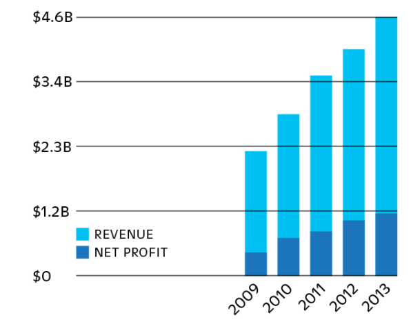
Despite the cult of Lego and it’s steadily increasing revenue figures, Shehnaaz Chenia revealed in her speech, the problems the company have faced in relation to their disjointed and discontinuous relationship between the physical and digital store – which has contributed to a confused brand identity
She explained how people felt unfamiliar and uninspired by the Lego website, so much so that some customers even questioned the authenticity of their official website.
It clearly didn’t translate the same fun and excitement of the physical store and on the back of this discovery, Lego implemented a strategy that would achieve them brand continuity across their physical and digital arenas, as a way to help shoppers feel connected in multiple retail spaces. They now aim to ensure that when customers visit any of their stores, they receive the same experience as they would online and vice versa.
This has included:
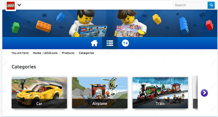
- Colour and architecture have been assimilated into one universal vision. The use of vibrant red, blue and yellow is consistent across the board, as well as it’s use of clear, dynamic architectural shaping, that mirrors the solidity of their Lego bricks, an aesthetic that has been implemented both instore and online. This colourful and consistent image helps to affirm a playful and creative dimension to the brand.
- A consistent brand tone has also been rolled-out. From the way their employees interact with customers in the store and during their child-friendly play sessions, this open tone has been similarly incorporated into the copy used on their site.
Lego’s strategic brand changes have helped to boost sales and enhance the customer experience. It’s now a brand that has united both its digital and physical channels – making it easier for them to truly inspire the builders of tomorrow!
While Lego has achieved clear brand continuity, they’re not alone, other internet retailing brands have and are developing similar branding strategies.
Here are a few others:
Apple
- Apple has worked out how to create a clear and continuous brand connection between their online and physical, high-street presence.Their branding pivots around an identity of streamlined simplicity and the removal of complexity from people’s lives.
- Simplicity and openness have been reflected in the open plan design of their site and stores – encouraging interaction, browsing, but ultimately a sense of community.
- Their specific vision of brand architecture, for example, their use of metallic finish, muted colours and shiny glass in the construction of their stores have been rolled out digitally on to their website, as well as the products themselves – perfectly tying everything in together.
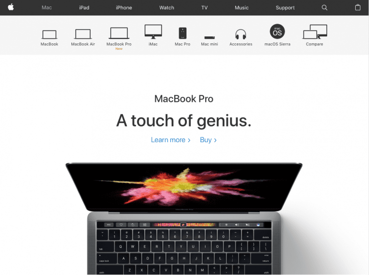
- The use of a minimalistic aesthetic – a silver, metallic motif in combination with the trademark Apple logo, present on all their products, in their stores and on their website, has become monolithic, immovable, iconic and a foundation from which to construct their recognisable, master brand identity.
- This has cemented their cult-like status as impenetrable, premium players within the consumer electronics and computer software industry.
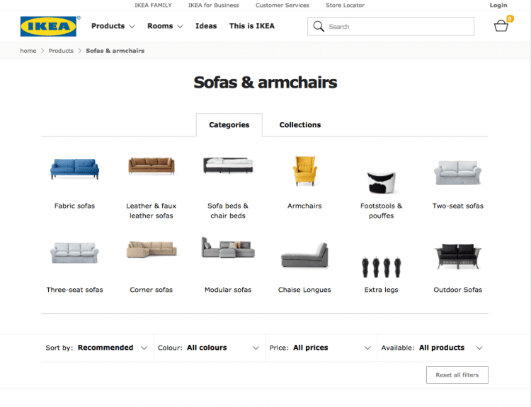
IKEA
- For IKEA, it’s clear that Swedish nationality and values are at heart of their branding. This is inferred by the striking use of blue and yellow, an aesthetic that has been influenced by the Swedish flag. They’ve boldly rolled this colour scheme out across their logo and in the stores general aesthetic.
- When people buy IKEA they buy the brand, which is distinctly two-fold. On the one hand, they’re offering serious multifunctional design. This no-fuss attitude also filters down to the sleek, hard lines of their store architecture and in the warehouse style aspect of their retail floor operations.
- However, behind their unwavering toughness, there has always been a flair for creating innovative work, designs which often become furniture staples in everyone’s home.
- They also look beyond their own functionality, embracing fun and playfulness, which is evident in their colour scheme and in the Swedish meatballs you can get in their restaurants!
- Their simple commitment to thrifty design is reflected in the simplicity of the website. Their logo is offset by the deliberate white background of their page and this allows their branding and their product design to speak for itself. No bells and whistles.
When it comes to branding and brand message, keeping it consistent is key. Apple, IKEA and Lego have all found ways to unite their branding across multiple channels, linking-up shopper experience and keeping it the same across the board, whether it’s online or in store. An experience of a brand should be the same wherever of however you access it!
Can you think of any other examples of brands that are getting it right, or maybe even badly wrong? Let us know @iwebtweets
Get in touch
We know commerce, let us help you improve customer experience, increase conversion rates, and make that digital change.
- hello@iweb.co.uk