Sadly for consumers, product pages often contain uninspiring imagery and a mere sentence for the product description – we’ve seen it numerous times before on too many websites.
As a retailer, you must understand that potential customers visit your product pages to gather all of the details about your product. As a result, providing them with as much information as possible will ultimately help them to become paying customers.
However, boosting the number of conversions on your product pages is no easy feat. There are many factors to consider though some priorities include:
- Creating an engaging marketing campaign to promote your product
- Implementing strategic pricing
- Producing captivating, high-quality product photos
As you can imagine, a lot of work is involved so we’ll put it into perspective… Your eCommerce website could potentially contain thousands of products and each one of these product pages requires your undivided attention to help them convert better.
In this article, we aim to provide you with more insight into what your customers expect from a product page so that you can understand and implement the best practice for boosting product page conversions going forward.
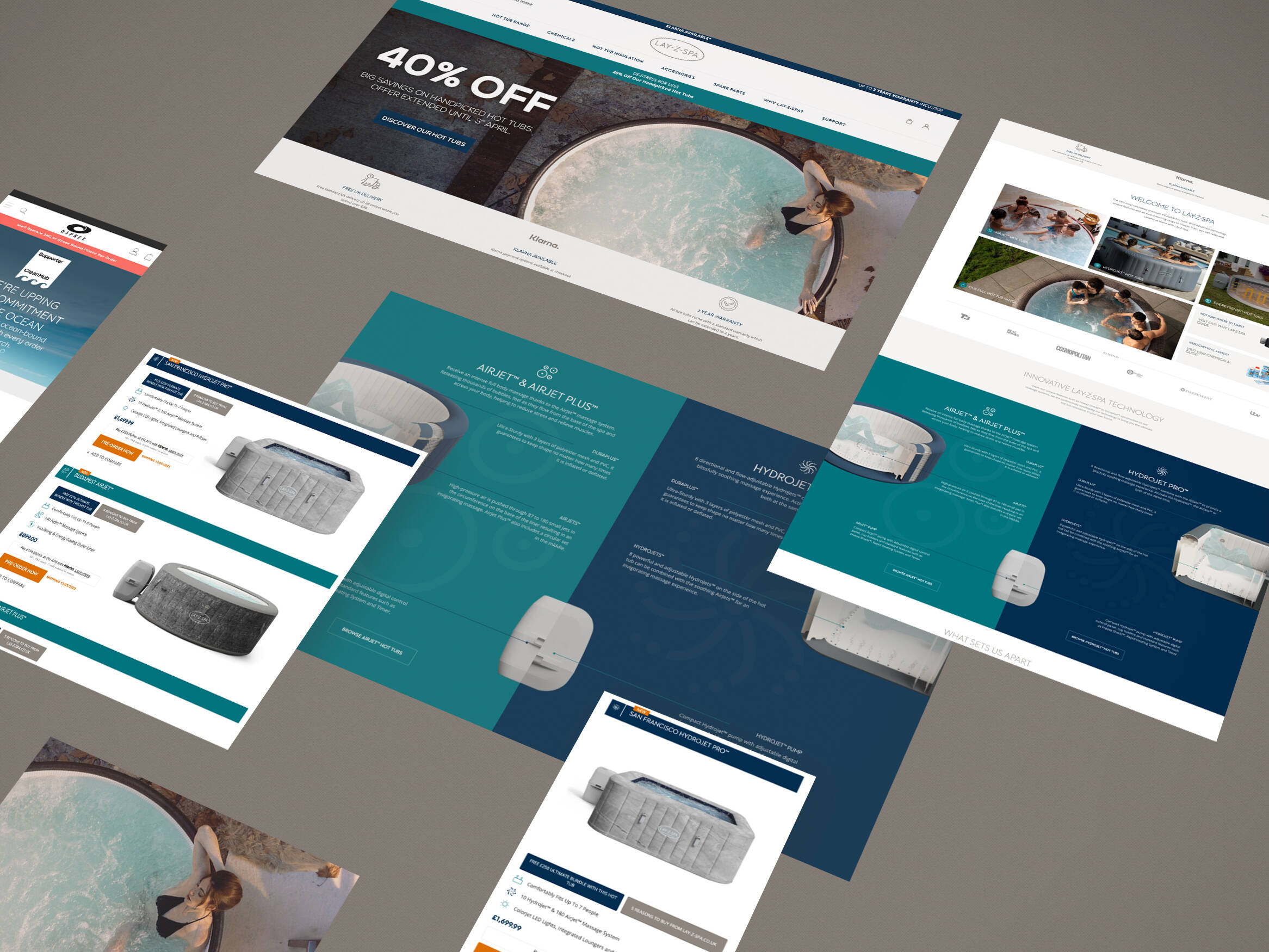
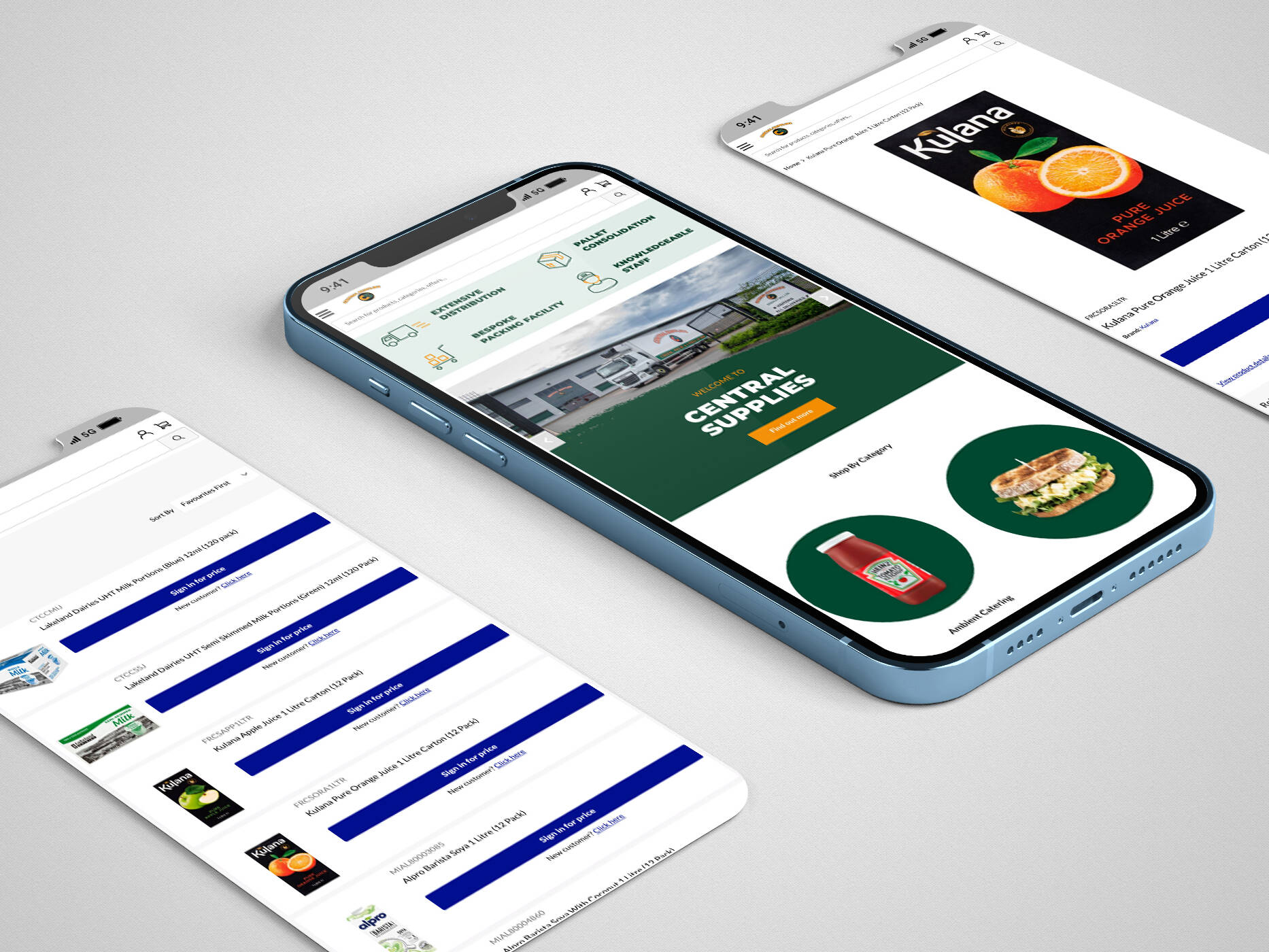
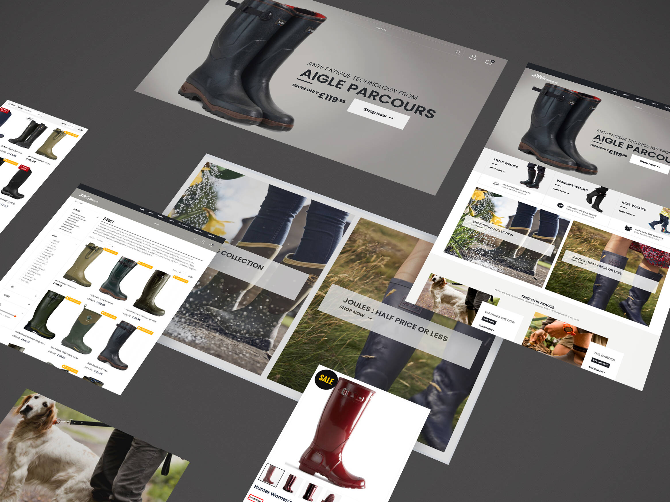
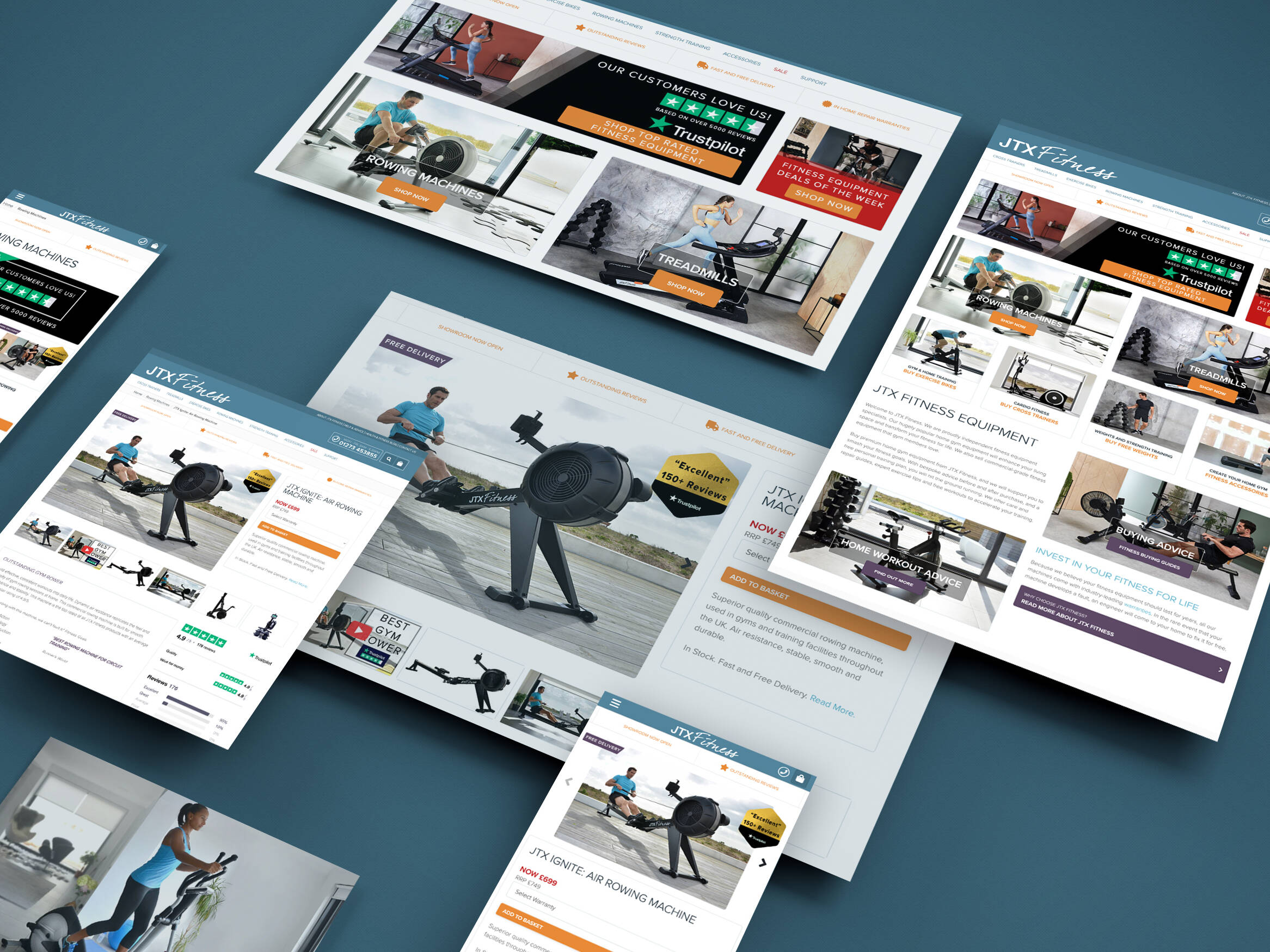
1. High Quality Product Imagery
Images are vital in presenting your product to the customer. They get to see the item in all its glory. Think in the mind of a consumer, you wouldn’t buy a new product if you didn’t know what it looked like, would you?
Below is a checklist of the top factors to consider when evaluating if your product imagery is fit for purpose:
- Be clear – You should refrain from uploading any blurry images to the site – each image should be clean and crisp. Ideally, you’ll have “zoom” in features that a user can use to see close up details hence it’s highly important your images are of the best quality.
- Be informative – Your imagery should include any instructional details such as assembly steps or similar to help consumers better understand the functionality of the product.
Be in context – For example, if you’re selling a handbag, it’d be great to show how the product looks when worn as well as on a white/transparent background. This will help to give users a better idea of size and so on. - Be true to the product – This means your imagery should show the correct product i.e. if your copy and details state the product is a white wardrobe, show the image of this exact product and not a copy or similar product.
- Be unbroken – Make sure you do not have “broken” images. You can tell if the image file is broken as you will see a broken file icon like below.
![]()
It’s also a good idea to use a feature image that best shows the product to the audience. A feature image is the first image that the user sees and so, it should paint your product in it’s best light.
Tip: A featured image represents the contents, mood, or theme of a post or page.
Alongside the featured image, it’d be valuable to include a gallery showing the product from different angles and in use. Again, this will help to put the product in context so that the user gets the best impression of the product which also makes the need to return the item, lower.
For strictly online sites, using a 360-degree view that can be rotated or a product video such as a “catwalk video” is highly recommended. This is to ensure your customers can easily see the various angles of the product and how it looks when in motion.
Tip: For clothing sites, 360-degree views and product videos are a must to ensure your user gets all of the product information they need to make an accurate purchase they’ll be happy to receive.
The below example from Scruffs shows a gallery of the product at different angles and in different context i.e when worn and when not. It also has a “zoom” feature for each image as well as displaying close ups of the product to show the finer details. Also, note that each image is of super high quality.

It’s super important to remember that online customers can’t hold and view the product themselves so it’s crucial to show them everything you can about the item.
2. Add Badges & Statements To Build Trust
Online fraud is, unfortunately, becoming more common so you’ll need to build trust and confidence with your customers. Plus, with it being so easy to shop around from retailer to retailer, it means lots of your customers could be within the “consideration” phase of the buying cycle.
As a result, you’ll want to fill them with the confidence they need to buy from you and stop browsing elsewhere. One way to do this is to include badges and statements that show you are a trusted seller.
Badges
Below are some examples of common trust badges that retailers can apply for. Of course, there are many other badges that you can use depending on the product you’re selling and the industry you’re in.
Tip: Research competitor sites, what badges do they show on their site? Can you apply for any of these?


Statements
Alongside badges, you should also include statements in prominent places on the product page and throughout the site, to instil confidence in your customers. Useful statements to include are:
- “We won’t be beaten on price”
- “In high demand”
- “FREE cancellation”
- “Buy with us risk free”
3. Customer Reviews
Due to the changes in buying habits becoming more so online, eCommerce reviews are everything to lots of customers. People like to read them to make sure they are getting what they’re expecting, not only in terms of the product descriptions and imagery but also from your overall service.
Reviews can be scary and no one wants a bad review on their website. It’s easy to avoid implementing a review system, thinking you’re saving your sales team from dealing with difficult customers.
Yet, if you don’t have some form of review system on your website the customers can and will leave reviews elsewhere on the internet regarding your products and service.
The best thing you can do is to embrace reviews and be active on them. If a customer leaves a glowing review, respond with a super response back.

If you receive a negative review it’s highly important that you don’t ignore it. Reply with a positive response. Acknowledge their issue and provide a solution to the problem. In doing so you will soften their negative thoughts and are more likely to purchase from you again in the future.
An example of a product review on the Argos website:

An example of Amazon customer reviews feature:

4. Remove The Clutter
Your product pages should act as a sale pitch, so only include the information that you really need to get people to buy the item. Don’t waffle and keep to the point with your content.
Remember that users scan pages rather than reading everything like a novel so adding bullet point lists and similar is a great way to make the copy user-friendly. It’s also important that your website design allows for white space between copy blocks. This will allow the user to focus on each element and find the information they are looking for quickly.
Take a look at the below example from the ASOS website:

5. Include FAQs
In many cases, customers can have questions about your products, particularly if it’s a larger, more expensive purchase as they’ll usually take more time in the “consideration” phase. It’s your job to make it easy for them to get these answers by providing the option to ask questions on the product pages.
No doubt there will be others who are also asking the same questions so having this information on the site can make save the time of your sales team responding to the same questions, repeatedly. It’s all part of customer engagement just like review responses.
Here is an example of a customer questions and answers feature on Amazon:

6. Be Mobile Friendly
Most people make a purchase through a mobile device nowadays. Therefore, you should make sure your website is mobile friendly and loads quickly.
If you don’t have a mobile friendly website and your potential customers are trying to buy from a mobile, they’ll be more likely to move on to another seller that is catering for their needs.
You should consider the following:
- Spacing – Make sure there is enough space between elements so that users can clearly see the content.
- Buttons – Make sure they are large enough and space efficiently so that users can touch then easily and correctly.
- Images – Your images should be optimised for mobile so that they load quickly.
- Checkout Process – You want to make the journey through the checkout clear, simple and free of clutter and unnecessary information.
Customers who are browsing and making a purchase with a mobile device are usually on-the-go and are an impulsive decision. As a result, making the above changes will refine the mobile user experience, avoiding any little snag from putting them off which ultimately helps you to generate those conversions.
There are a couple of free tools provided by Google to help test your site speed and mobile friendliness:
PageSpeed Insights
Mobile Friendly Test
7. Detailed Product Descriptions
Product descriptions are one of the most important aspects of your product page. Once the user has identified the product through the top quality product imagery, they’ll be looking at the finer details such as sizing, material and more to further influence their decision.
This is your opportunity to sell your product so provide as much information as possible about the product.
- Provide important information first
- Benefits of the product
- Any unique selling point
- Match the tone of your audience
- Tell a story of how the product is used in everyday life
When users can connect with the product and visualise themselves using it, it puts all of the information into perspective for them. As soon as you have the customer happily considering how they’ll look in your top or what they’ll make with your drill and so on, you’ve pretty much bagged the sale.
Below is an example of a product description for a TV sold by Currys. Note that it’s pretty in-depth and contains headings and bold text to show stand out information that the consumer can easily glance through.

8. Social Proof Your Products
Social media is a powerful tool to behold, especially for an eCommerce business. Use it to your advantage by displaying user-generated content from social on your product pages.
People will see others using and enjoying your products which can iinstiltrust and confidence in your business and they’ll be more inclined to spend their hard earned cash with you.
Tip: You should also include social share icons this allows users to quickly and easily share your product with others.

9. Create FOMO (Fear Of Missing Out)
The fear of missing out or FOMO is a way of adding a little pressure on the customer to buy a product. It’s like saying if you don’t get it now then you will miss out.
There are a few ways you can create FOMO these include:
- Showing how many of an item is left in stock
- Displaying how many people are looking at a product
- How many have looked at the item in the last hour
- Show a popup message when someone makes a purchase
- Highlight when an offer is for a limited time only
The example below is showing how a holiday villa website creates urgency by displaying that there is only “1 property left” for the selected dates and the other result shows you have “just missed it” making the customer more inclined to book there and then.

The example below shows how many people are looking at a product at the bottom right of the screen.

10. Display Similar Products
A user may view your product and feel it’s not the right one for them. Instead of letting them leave empty handed, help them out by showing them alternatives that they might be interested in.
By displaying “similar products” that accompany the product they’re currently looking at, you can cross-sell and up-sell the products – a sales advisors dream.
The below example shows a list of other products that are similar to the product the consumer was previously looking at which gives them lots of other options to increase the quantity within their basket.

A slightly different example from Amazon shows a selection of items, including one that you previously browsed, i.e. the PlayStation, that were bought together. Again, this encourages cross-selling to create a higher sales value.

11. Extra Rating Features
Rating features such as star ratings are great for users to see what other customers thought of the product at a quick glance. If products are receiving low star ratings you can further analyse the Google Analytics data to make a decision on whether to continue to stock and sell that item.
You can also analyse whether the product description and imagery displayed are suitable to that product and are describing the item accurately.
The below example taken from Argos shows how a product with a 5-star rating next to a product without a rating is far more enticing to click through to.

12. Calls To Action
Calls to action (CTAs) will provide a clear indication of what to do next. Rather than feeling lost on your site, you should add buttons such as “Buy Now”, “Add To Basket” or “Get In Touch” to encourage your consumers on taking a further action on your site. They should be displayed clearly on your site and in places that customers will easily see.
Good To Know: There are two types of CTA, primary and secondary. Primary CTAs include “Buy Now”, “Add To Basket” or “Get In Touch”. Secondary CTAs include “Leave a Review”, “Ask a Question”, “Provide a Star Rating”. It all depends on your website goals.
An example of a primary CTA i.e. “Add to Basket” can be seen below:

An example of a secondary CTA, i.e “Submit Review” can be seen below:

Conclusion
As you can see there are many factors to consider when looking to boost conversions on your product pages. The user should always be at the forefront of your website, after all they’re the ones using it and buying through it. Make the experience as user-friendly and streamlined as it can possibly be.
The eCommerce world is constantly changing with new trends and technologies emerging, so it’s important to stay up to date and make any changes to your product pages or site in general, when necessary.
Here at iWeb, we can help you create and improve your product pages to make the work for you. We encourage you to contact us on 01785 876410 or instead, you can email us.
Get in touch
We know commerce, let us help you improve customer experience, increase conversion rates, and make that digital change.
- hello@iweb.co.uk