Ecommerce websites are the new high street with more people shopping online than ever before it’s important to get your online storefront right. Here’s a selection of three refined eCommerce websites in 2019.
1. Samsung Gear Fit2 Pro
If you’re a business that sells your own products like Samsung then you may have the time and resources to really be creative too with an engaging product page layout.
In the instance of the Gear Fit2 Pro product pages, Samsung takes a more in-depth approach to show off their products.
They provide clear information which promotes the benefits and features of their product.
These snippets of information are accompanied by strong visuals of their target audience using the product in real world situations.


The product pages are lengthy but this works as the copy isn’t too long. It gets to the point and tells stories of how the product would be used in real life situations, so that potential customers can relate to the product and make a connection.
Here is an example of this storytelling below:
Lighten your load
Track your location and listen to music – even without your phone. Gear Fit2 Pro has built-in GPS to keep a record of where you work out. The Spotify app lets you listen to music via Wi-Fi or play playlists on the go in Offline mode.
Familiar eCommerce Elements
Even though they promote their product in a more engaging way than a typical eCommerce website such as www.argos.co.uk, familiar elements are still available on the page.

The important features to encourage a user to make a purchase are positioned towards the top of the webpage. If users want to indulge in more information, they can scroll down a page full of engaging visual content highlighting product features and benefits.
Some of these features used are:
- Frequently Bought Together – Allows for cross-selling of other items such as accessories.
- Image Gallery and Zoom – Provides a view of the product from multiple angles.
- Customers Also Viewed – Shows users other product options they may not have thought of before.
- Specifications – Lets the user know product technical information such as dimensions and weight.
- Reviews Section – Gives customers the opportunity to leave a review and potential customers the chance to see what others are saying about the product.
- Support Section – This allows customers to view and download user manuals and also includes the option to start a live chat.
Design
Responsive design is used which is pretty much industry standard now as it allows you to have one website that is tailored to multiple devices. The desktop version of the site uses a clear spacious design that is easy to navigate, make a purchase or find a local stockist.
The mobile version of the site uses a mobile-friendly design and contains all the same features and information that you see on the desktop version with elements nicely spaced out.
Buttons and features are easy to use with larger fingers and thumbs due to their spacing and the pages use clutter free design.

Desktop view example of the site design.


Mobile view examples of the site design.
2. Argos
The Argos website is a perfect example of how an eCommerce site should function. Over time, Argos have continued to perfect its user journeys from the moment a customer lands on the website through to checkout completion.
Primary Navigation
The desktop version of the Argos website uses a mega menu as its primary navigation. Even though it doesn’t display every possible category. It does contain the most popular sub-categories in each of the categories. These are accompanied by the option to shop all in each category in the menu.
Ecommerce websites that create their main navigation in this way tend to make evidence-based decisions using some form of analytics software such as Google Analytics.
Side Navigation
It’s important to offer customers the easiest ways of navigating your website. Argos uses various navigational elements to make the user experience as good as possible.
After the primary navigation, the secondary navigation is the side navigation across all category pages on the website. Again, this form of navigation is familiar with customers globally that browse your website on a desktop device.
The side navigation displays all of the sub-categories that are hidden from the primary navigation.
The navigation on the mobile view of the site is slightly different. A mega menu just wouldn’t be a viable option for use on mobile devices.
Argos uses collapsible navigation showing only the top level categories when the user is on the home page. As the user moves to the deeper category pages the navigation stays the same as side navigation from the desktop view of the site.

Example of the Argos mega menu in desktop view.
Other Navigational Elements
Argos also implement other navigational elements to help customers find the products they’re looking for including:
- Breadcrumb Trail – Used to allow customers to understand where they are at within the website structure.
- Filters – Filters are an essential feature that all eCommerce websites should have. They allow customers to narrow down the search results to help them find what they’re looking for.
- Footer Links – Used to provide more non-product information such as payment methods, about Argos and other customer services information.
Design
The Argos website uses a clean design layout that’s hugely familiar to customers and used many times before. And that’s ok. People like what they know.


Example of Argos website design in desktop and mobile views.
Elements are spaced out nicely using a grey background and white elements. This helps products and features to stand out to the user.
The product pages are again a classic eCommerce website product page layout consisting of the standard image gallery, product price, description and primary call to action of “Add to Trolley”.
Scrolling down the page provides the user with a raft of features that are initially in a collapsed state as to not overwhelm users with too much information.


Example of a product page in both desktop and mobile views.
As good as the desktop version of the website is, the mobile experience is more important than ever before these days as many people purchase items through a mobile device. From a Search Engine Optimisation (SEO) point of view having a mobile-friendly version of your site is a must.
The desktop experience a person encounters needs to be converted into a mobile experience that is just as good and easy to use.
Argos have managed to recreate the full desktop experience in a great mobile-friendly design. The same information and elements are present but with reduced information such as the number of items in a carousel or hiding large pieces of content behind a read more touch point.
Although less information is displayed to the user it doesn’t result in a poorer user experience. It continues to provide the information a user needs to make a purchase decision.
Useful Features
The Argos website contains many useful features that many people will have seen before on numerous websites including:
- Image gallery and zoom – Allows customers to inspect and get a closer look at products.
- Reviews – Providing the pros and cons of a product from other customers.
- Frequently Bought Together – Gives the opportunity to cross-sell and up-sell to customers showing other products that accompany the product, for example, it could be batteries or a carry case.
- Questions and Answers – A good way of providing answers to customer questions on particular products to help them in the decision making the process.
- You May Also Like – A useful way to show other items that a user may not have thought about initially that are similar to the one they are currently looking at. This could lead to multiple items being purchased.
The full set of features on the desktop version of the website are all available on the mobile view of the site and presented in a mobile-friendly format. For example, filters down the left of a product page are condensed into a single touch point towards the top of the category pages.


Example of the Review feature on desktop and mobile views.


Example of the Question and Answers feature on desktop and mobile views.
3. Apple
Apple takes a slightly different approach to how their website is structured.
Navigation
A user selects the product or services from across the primary navigation across the top of the page.
Once the user delves deeper into a product range they are presented with secondary navigation that makes use of clickable icons of the products and text links.

Footer links are also used well to promote other services and information outside of the primary products.

Call to actions throughout the site a clear text links such as Learn more about Photos and Learn more about Final Cut Pro X. Example below:

Product Range Information
The user is then taken to another page where they are presented with information about the product. The content highlights the benefits of the product. They also include real world situations that customers can relate to in the text along with various specifications.
Apple tends to include a lot more information than the Argos and Samsung websites. They know their users and that they want to know as much about their products as possible before making a purchase.
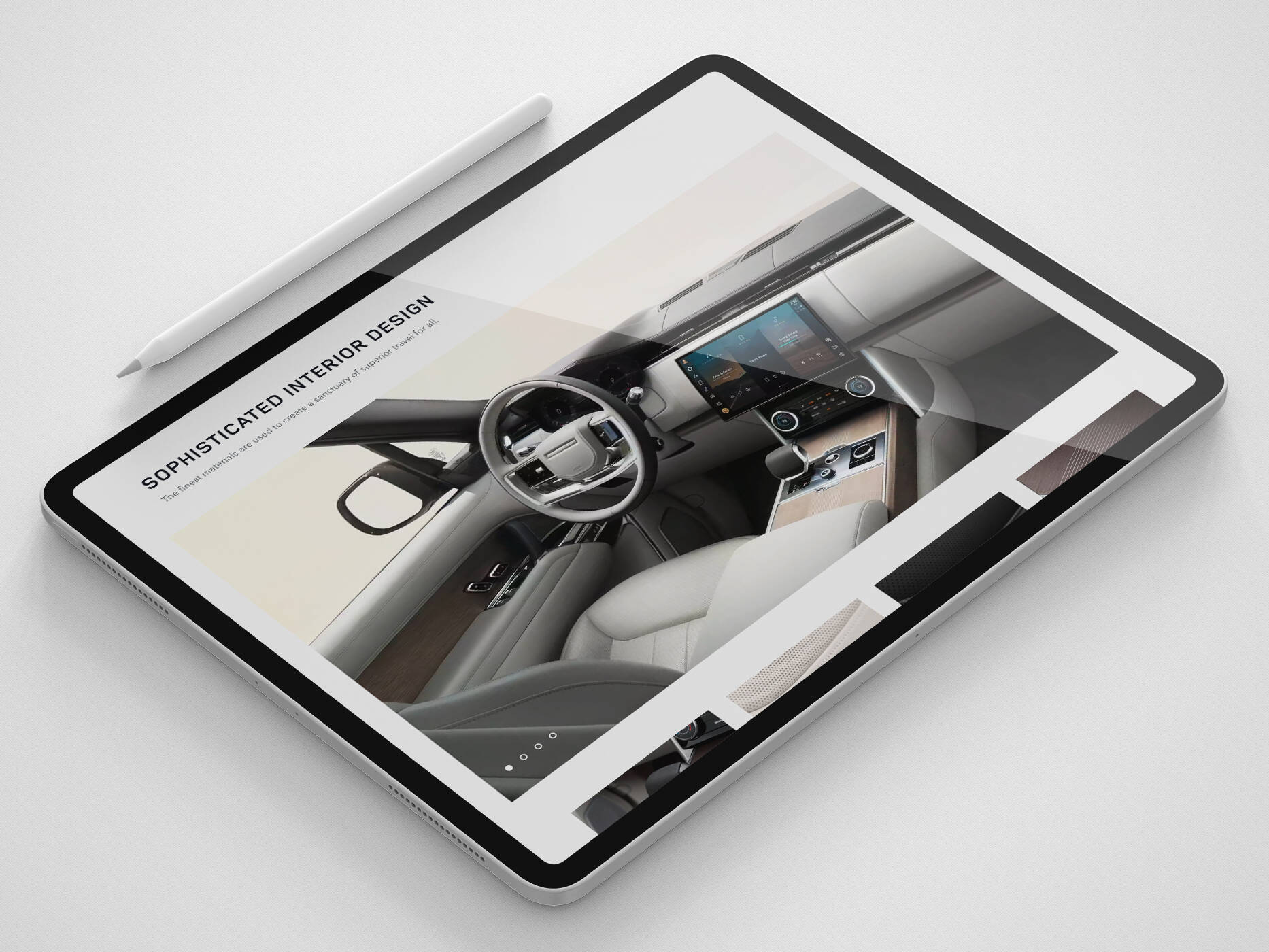
The images they use show the product on its own rather than showing it in real situations.

Example of the style of product imagery that is used throughout the website.
The product range information pages are all different when it comes to the layout and the type of information that is presented. For example, the Apple Watch takes a more tiled approach compared to that of the MacBook Air which is a long scrolling page that is broken up into sections.
Using different layouts for each range of products and services makes the website more engaging.
Purchase
The next step of the journey through the site is the Shop Now section of the website. This brings the user back to a familiar style of an eCommerce website.

The features used on product pages are quite minimal compared to other eCommerce websites. Although, the features that the site does implement are as follows:
- Tech Spec – Provides the finer details about the Apple product such as screen size and processor information.
- Colour Selection – Allows users to select their desired colour device.
- Add To Favourite – Choose your favourite Apple devices to look back at again if you aren’t quite ready to make a purchase.
- Delivery and Click and Collect – Various information and options for these services are available to the customer.
- Comparison Tool – To help you decide which model is right for you.
The features above were taken from the MacBook Air section of the website. Different products and services have similar elements and some that are unique to that particular product such as the Apple Watch Nike+ which allows users to select Case Size and Connectivity options.

Even though there are different page layouts Apple know their customers and know what information to provide and when.
Responsive Design
Apple like Argos and Samsung make use of responsive design to accommodate multiple devices. The same information is displayed on both desktop and mobile. Whereas the desktop view uses small animations in some of its images as you scroll, on the mobile view these images become static. This will be to help improve site loading times on mobile devices.
Closing Thoughts…
There we have it, three different eCommerce websites, each with their own styles but have many similarities so that users can feel comfortable when using their websites.
Need help or advice on your eCommerce website? Our team of experts can help. Get in touch today.
Get in touch
We know commerce, let us help you improve customer experience, increase conversion rates, and make that digital change.
- hello@iweb.co.uk