When we take an in-depth look into eCommerce site search, we’ve found that it’s often poorly executed across the board by too many businesses, though particularly on mobile devices. Not only is it hard to find, with the site search boxes often being too small to notice, but the results that we receive from the search box don’t get much better.
Despite this, we’re seeing that site search is growing as a preferred method to find a product with 43% of shoppers heading straight for the search bar. Consumers often perceive it to be faster than category navigation, especially when they have an idea of the product or service they’re looking for.
So why do we fall short on making our site search as good as our menu navigation? This post will explore this question and offer 9 best practices you can implement to improve your eCommerce site search.
What we know about eCommerce site search…
It’s clear that search is evolving and the number of people searching is rapidly increasing. Customers use the site search to tell merchants what they want. From then, it’s the merchant’s job to direct a shopper to where they want them to go, ideally to the product the customer is looking for.
Particularly within fashion, beauty, automotive and parenting, site search has dramatically spiralled in popularity. Hence, if you’re a merchant within these industries, it’s important that you seriously evaluate just how well your site search is performing or in many cases, under-performing.

It’s interesting to see that due to the rise in mobile usage, site search on mobile has also increased by a considerable 136% between the second quarter of 2018 to the first quarter of 2019. As a result, it’s imperative to make sure you are at least giving mobile as much thought, if not more, than desktop.
The Sad Truth
So, as already mentioned, there’s an overwhelming number of retailers who are delivering inadequate site search. It’s no longer enough to show a handful of text search suggestions and then a bare, “no results” page if the consumer query cannot be returned.
Put yourselves in the consumers’ shoes. If you were either a little bit intrigued about a product or even desperate to get your hands on it but you couldn’t find it, simply because of mismatched data, limited suggestions or minor misspellings – all of which can be easily corrected – you’d get pretty frustrated with the brand. Frustrated consumers lead to disloyal customers and for you, reduced sales and a negative brand persona.
“70% of (desktop) eCommerce search implementations are unable to return relevant results for product-type synonyms (requiring users to search using the exact same jargon as the site).
34% don’t return useful results when users search for a model number or misspell a word with just a single character in the product title.” – Baymard
Remember, if your customers are spending time searching for a particular product on your site, they’re likely to be further down the sales funnel than other potential customers on your site. It’s critical from a sales perspective that you ensure you’re doing the most to help them to convert.
The 2 Types of Online Shoppers
Broadly speaking, there are two types of online shoppers, Browsers and Searchers:
Browsers
Browsers are your online window-shoppers. They don’t know precisely what they’re looking for or even how to verbally express what they want but they have an idea that you might have what they’re looking for.
Often, their search queries are a lot shorter and less specific as the user isn’t necessarily sold on buying one of your products. Instead, the consumer wants to see what you offer and whether it’s along the lines of what they desire.
For Browsers, you can expect search queries like:
- “satin dress”
- “camera bundle”
- “Audi A1”
Shoppers
Searchers are shoppers who exhibit clear intent. When navigating your site they are looking for a category of products, a specific product, colour or even an SKU (a product code). You’ll often notice the search queries are a lot longer as consumers are able to give more details about the product as they tend to know more about them.
For Shoppers, you can expect search queries like:
- “Petite Satin Brown Dress Size 8”
- “Panasonic DMC-FT5 3D Black Camera Kit”
- “Black Audi A1 16 Reg”
- “38391 Leopard Bomber Jacket” – note this search query includes an “SKU” or product code
So, by now that you know a little more about eCommerce site search and the two main types of consumers you are catering your site search towards, let’s take a look at the 10 best practices for eCommerce site search…
#1: Make your search box easy to spot
Making your search box super easy to find applies for both desktop and mobile. With consumer buying habits becoming more and more focused to mobile, it’s important to prioritise the whereabouts of your search box in the mobile browser or mobile app design, rather than the desktop design – though that doesn’t mean you should neglect desktop.
Although fashion retailer, Zara, have a slightly controversial website design, they know how to position a search box. It sits at the top of the page, in the middle of the page against a clear, contrasting background so it’s super easy to distinguish.
They also have multiple banners ranging from static images to moving images which they’ve ensured still show their search box, logo, menu navigation and more so that they don’t get lost with the video content.

When it comes to their mobile site search, they position the search box in the same way, at the top of the page and in the middle, again, against a clear, contrasting background.

When you then tap on the search box, you are prompted straight away with “TRENDS” that are relevant to me as a female shopper and focus on recent products and searches I’ve browsed i.e. dresses, bags, tops and skirts.

#2: The search box should be big enough for a basic enquiry
Secondly, you should make the search box big enough for a basic enquiry. This is because not every customer will know what they want but you should have enough space for them to see what they’re typing. That’s whether they’re searching for “Black T-shirts”, “Petite Satin Brown Dress” or “Panasonic DMC-FT5 3D Black Camera Kit”.
Of course, eCommerce powerhouse Amazon does an excellent job of this yet, with the masses of products they stock and the fact they supply from other brands, it’s expected consumer search queries on their site will be considerably longer.

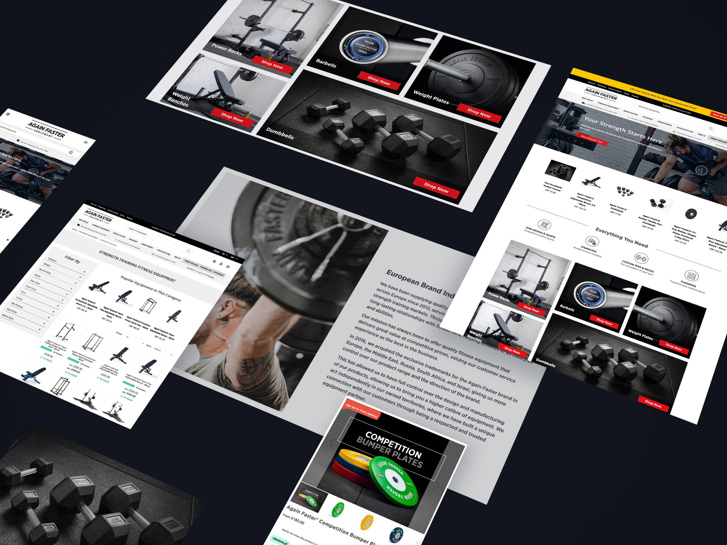
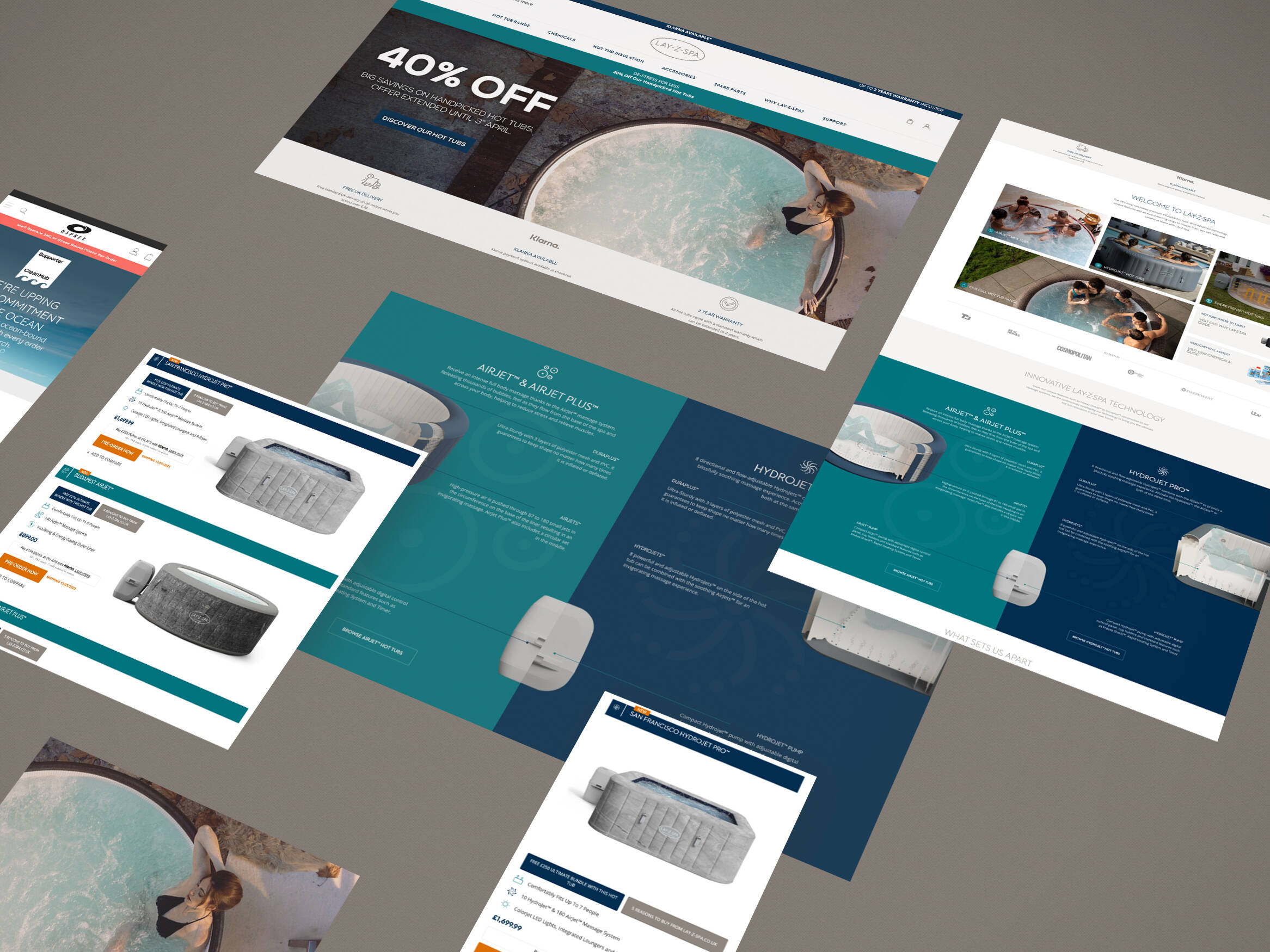
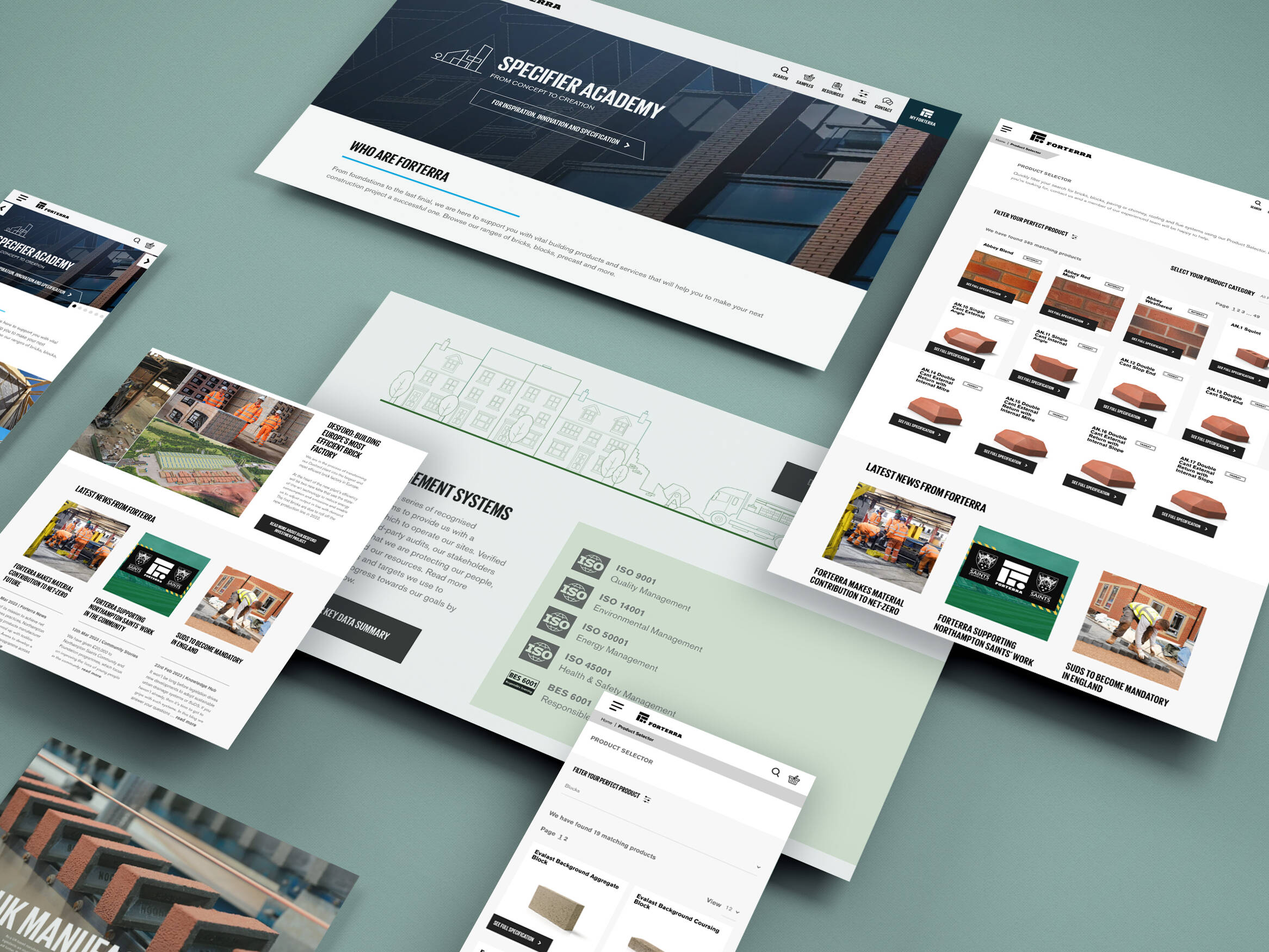
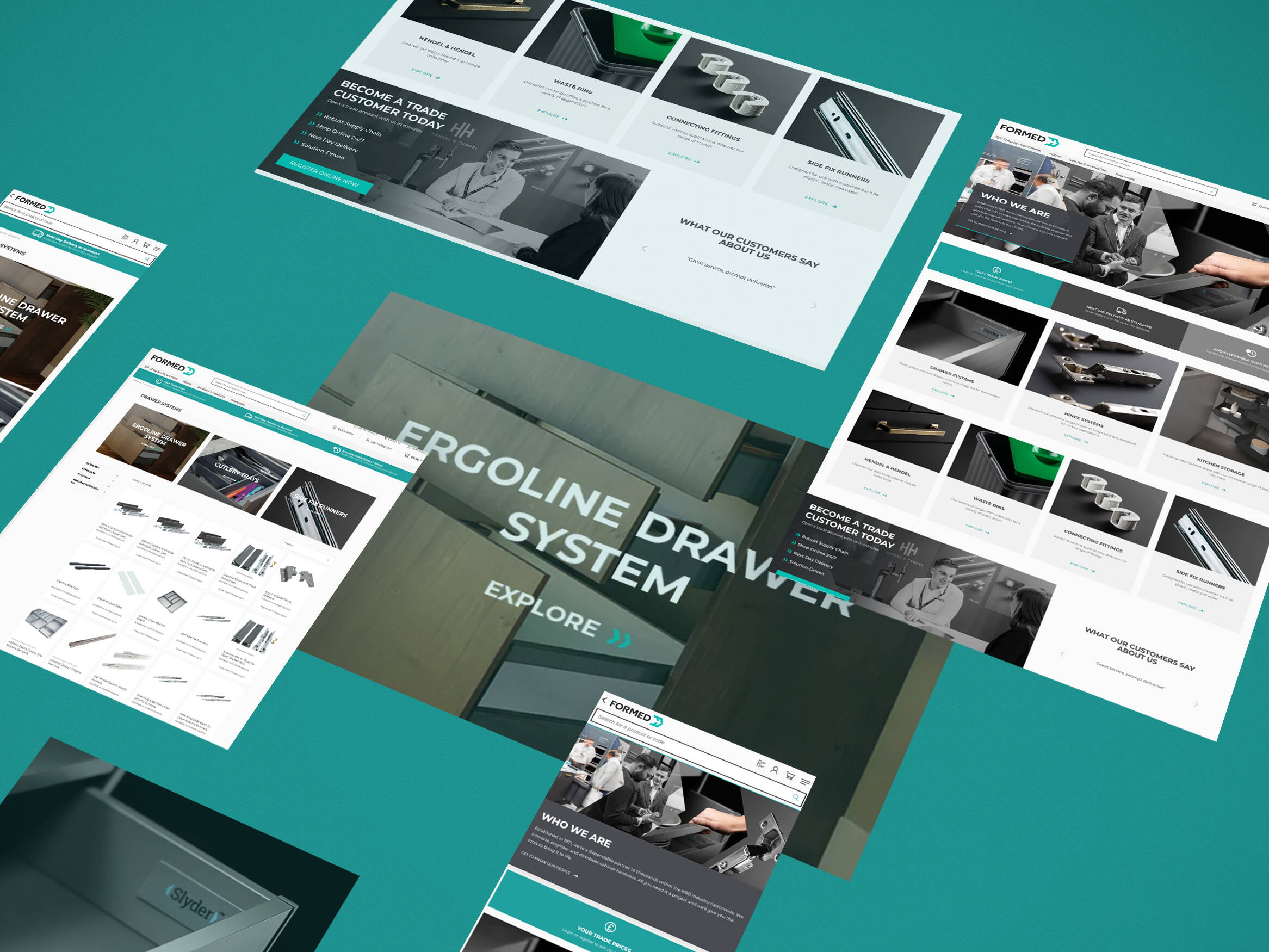
Also, see below for our client example from Tile Giant. Although this search box isn’t quite as large as Amazon, it ensures that the website header is overly cramped, so that users can distinguish between menu tabs and buttons.
Plus it gives them leeway to add in any relevant buttons like the “special offers” or “store locator” if necessary.

#3: Place text within the box to prompt users
The next step is to ensure you have text placed within the box to prompt users with their search query and help them to distinguish it as a search box. This could be stating the obvious, for example, “search”, “search product or brand” or taking it a step further and stating “What are you looking for…?” which Amazon uses on its mobile application.

By asking this question it makes it a little more interactive and engaging for the user by mimicking what might be said if they were speaking to face to face to an employee in the store (or perhaps Amazon’s Alexa, through voice search). It helps to improve the consumer buying experience and starts a conversation with the user, creating emotion between the individual and the retailer without them really realising it.

Important: It’s crucial, if you are going to include text in the search box (which we highly recommend), that you ensure it automatically deletes when the consumer starts typing.
Otherwise, it will add more time to the buyer’s journey with having to manually remove the text before they can search. This, as you can imagine, can be extremely annoying!
#4: Implement autocomplete or product suggestions
The fourth best practice is to implement an autocomplete or product suggestion prompt to your search box. This can easily be done using a third party tool like Klevu search.
But why? Like many third-party search plugins, Klevu uses a clever Javascript overlay which makes it easy to enhance your search results with autocomplete, product suggestions or even category suggestions, to give your users more options, spurring more interest.
Not only this but having Javascript overlay will help to make the site search fast and predictive which reduces time in the buyer’s journey, something many consumers are itching for. Plus, with the new product prompts and fast-paced search speed, you’re able to deliver your best possible search interface.
If you were to opt for Klevu, here are two examples of how the search box could look if you use one of their “out of the box” Javascript overlays.

Did you know? You can personalise your search box to include everything that you want to show your consumer, based on research of what they want to see. That way you know you’re delivering site search that is bound to be successful.
It’s to no surprise that search typically helps to convert 3 times better than a category led journey.
#5: Make your search results accurate to the query
You might think your search results are great; you offer product suggestions, category suggestions and have a clear, sizable search box. However, what’s important is whether the results the consumer receives are accurate.
Check, are they showing the correct product? i.e. if you search for a blue shirt, you should see only blue shirts.
It’s a common issue that retailers often overlook. They think because their site search offers the consumer lots of options and chucks a load of, what they deem “relevant”, information at them, they’re winning. Yet, a lot of the search results aren’t true to what the consumer had in mind.
Tip: If you are a larger retailer, you should take extra care when ensuring your site search is giving accurate results as you’ll often have a wider product range that your audience will want to choose from.
Moreover, it’s important that if the product they’re searching for its out of stock or simply doesn’t match any products on your website, that you don’t show an empty “no results” page.

Instead, you should take this as an opportunity to spur interest in another product by suggesting an alternative or similar item. For example, with client TW Wholesale Ltd, when the search term “pasta” is used, you don’t get a 0 results page but instead are shown items related to “part” or “paste” and so, it’s catering to user misspelling and giving them extra inspiration or a next step rather than showing them an empty page.
You could also include any social media icons, links to offers (that won’t be temporary links that soon go out of date) or perhaps your news or blog section.
#6: Show non-product results
Just like it’s encouraged to show non-product results on your “no results” page, you should also include non-product content in your site search results. For example, if you have a relevant buying guide, how to guide or service that relates to their query, show it.
Non-product results shouldn’t be displayed as the star of the show, in fact, we encourage that they’re shown only as additional features that cater to the “browser” rather than the “shopper”, i.e. the consumer who needs a little extra persuasion. This is because, even if it’s not exactly what the consumer is looking for, these resources act to spark interest and make your brand look a lot more knowledgable, helpful and professional.
After all, if a user can see that not only do you sell “Audi A1 alloy wheels” but you have a guide on how to care for them, a guide on how to clean them and another on how to fit them at home, you’ll stand a better chance of being liked and adopted by the consumer, creating brand loyalty.
Take a look at this example with Stadia Sports:

Here you can shop their products, categories, buyer’s guides, specific pages and blogs posts related to “rugby posts”. That gives your browser a lot of useful information to take a look at.
#7: Cater for common misspellings
Another important site search feature is being able to cater for common misspellings. Although you as a merchant understand your products and will often know them inside-out, your consumers won’t, especially new consumers. They’ll make errors in their spellings whether its deliberate or not and your site search should be able to recognise this and still pull up relevant results.
John Lewis’ site search is a good example of catering to this. Whether you make spelling errors by missing out letters, including numbers or symbols or similar, you can still retrieve an accurate set of product results. E.g. The misspellings within the query, “blck melber6y bag” still showcases a selection of “black mulberry bags”.

#8: Cater for synonyms
As well as catering to misspellings, it’s important that you cater for synonyms within search queries, too. Although you might refer to a product as a “flip knife”, the brand could refer to it as a “folding knife” or “pocket knife” and so, it makes things a little difficult if you don’t allow for these synonyms or at least include product suggestions in image format, other product categories or similar items.
#9: Show the search query on the results page
The final best practice to discuss is to show the search query on the results page. That way users know what they typed in so if they can’t find the exact product they want, they can try another query or add in a keyword that might be more specific to the product they’re looking for, making it easier to sort through your products.
To Conclude
To summarise the above, you should:
- Make your search box easy to spot.
- Make the search box big enough for the average query.
- Place text such as “search for a product” within the search box to prompt users to use it.
- Add autocomplete features and product suggestions as the consumer is typing their query.
- Make sure your search results are accurate to their query.
- Show non-product results such as blog posts, how-to guides and category pages.
- Cater for common misspellings.
- Cater for synonyms.
- Show the search query on the results page to show users what it was they typed into the search box and which keywords returned that specific result.
It all sounds super simple and rather obvious, right? By using a tool like Klevu you can be sure to enable all of these 9 best practices (plus many more) in order to deliver the best possible search experience for your consumer. Want to learn more? Get in touch with us today.


Get in touch
We know commerce, let us help you improve customer experience, increase conversion rates, and make that digital change.
- hello@iweb.co.uk