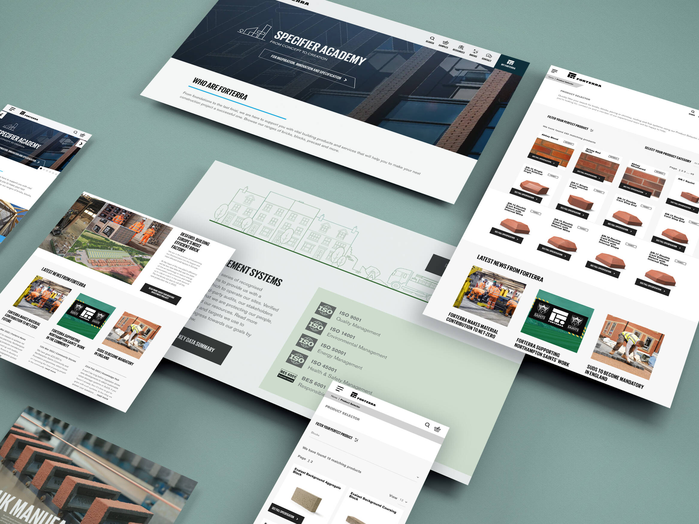
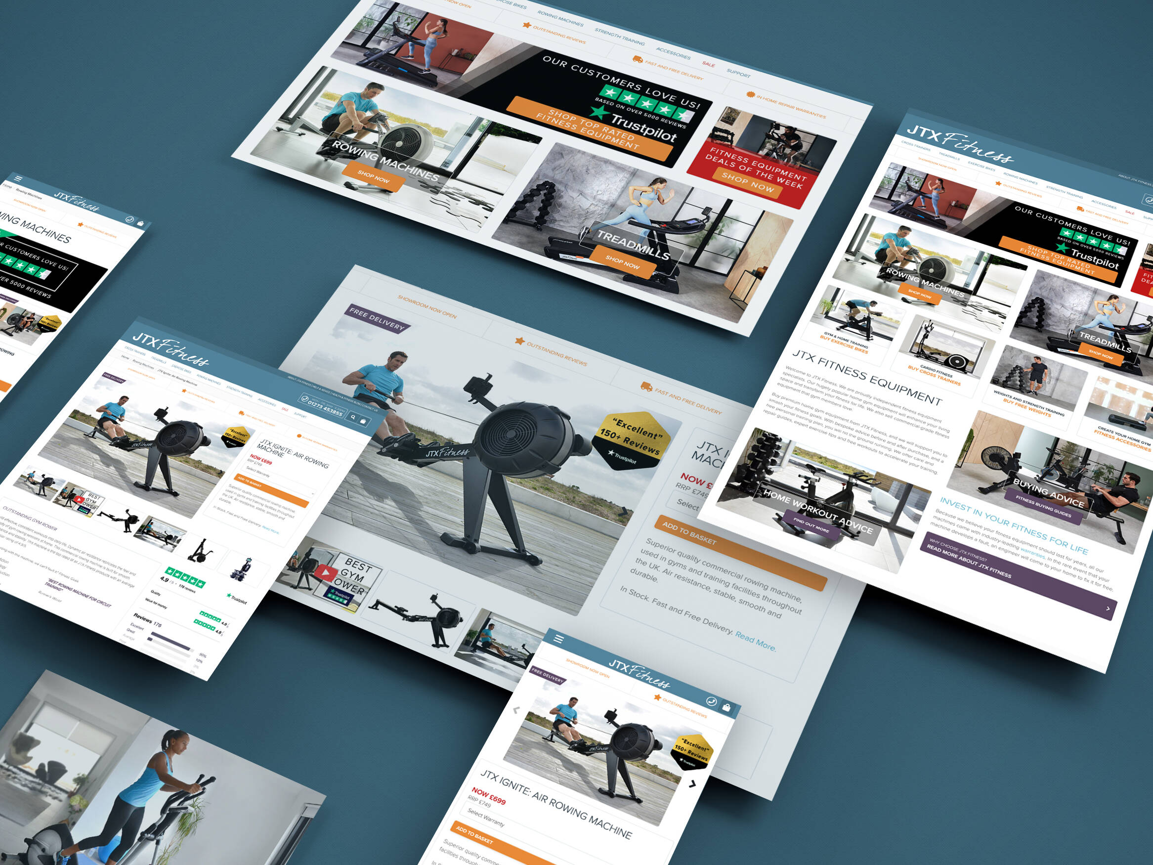
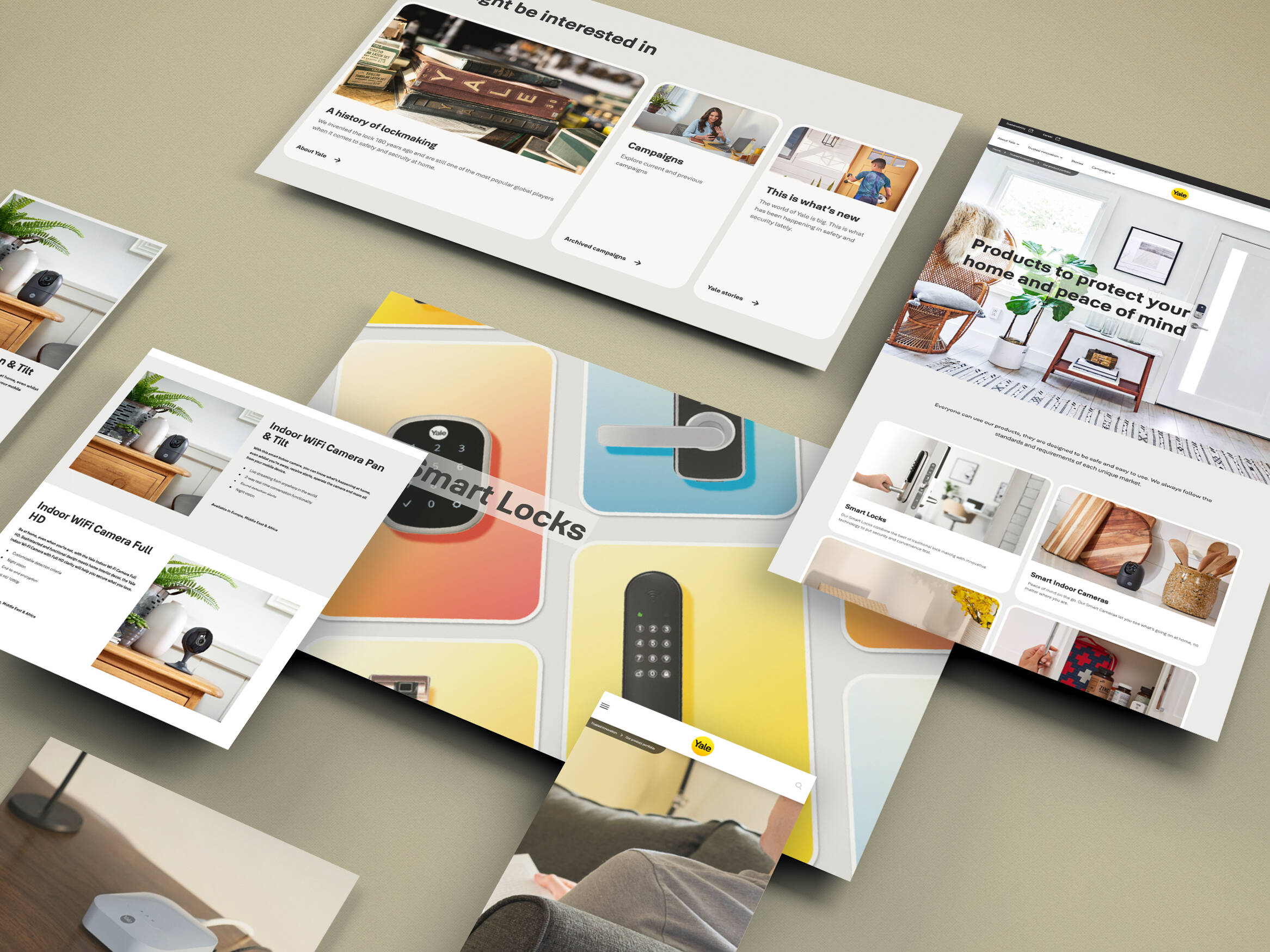
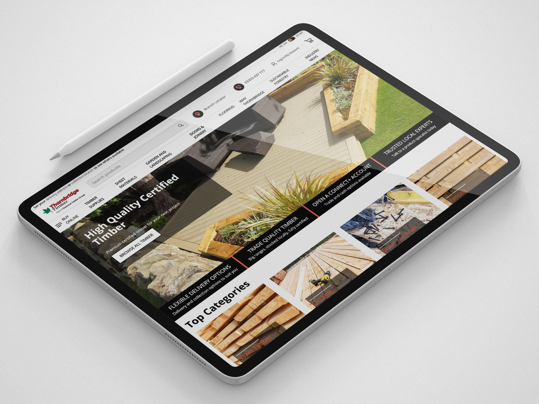
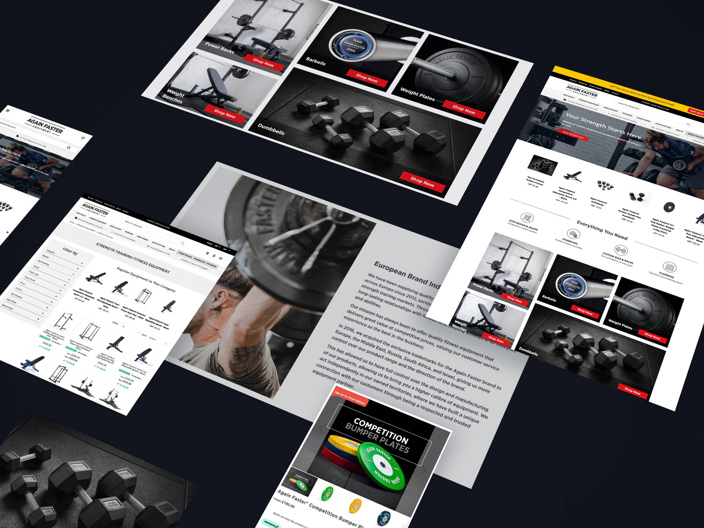
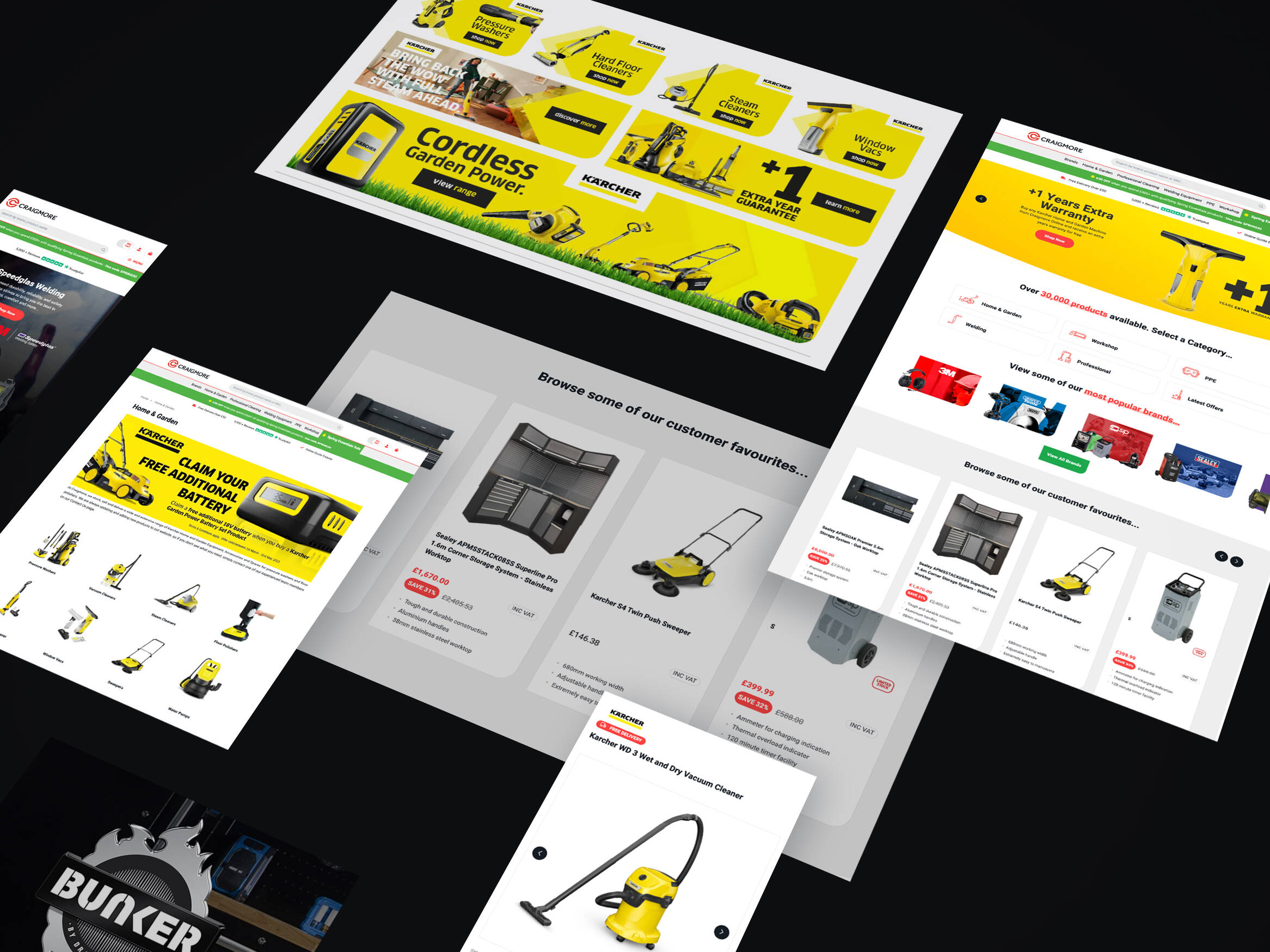
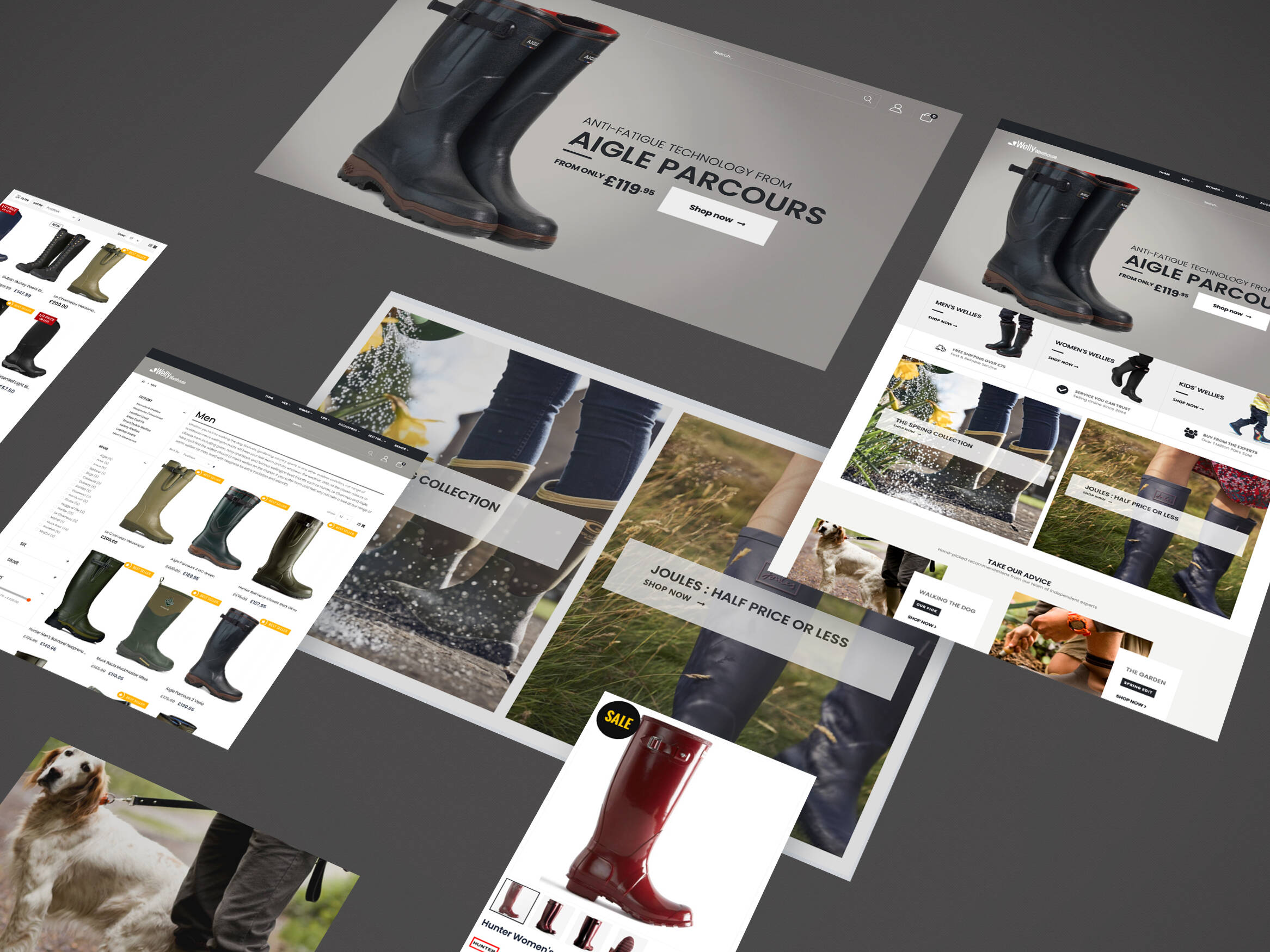
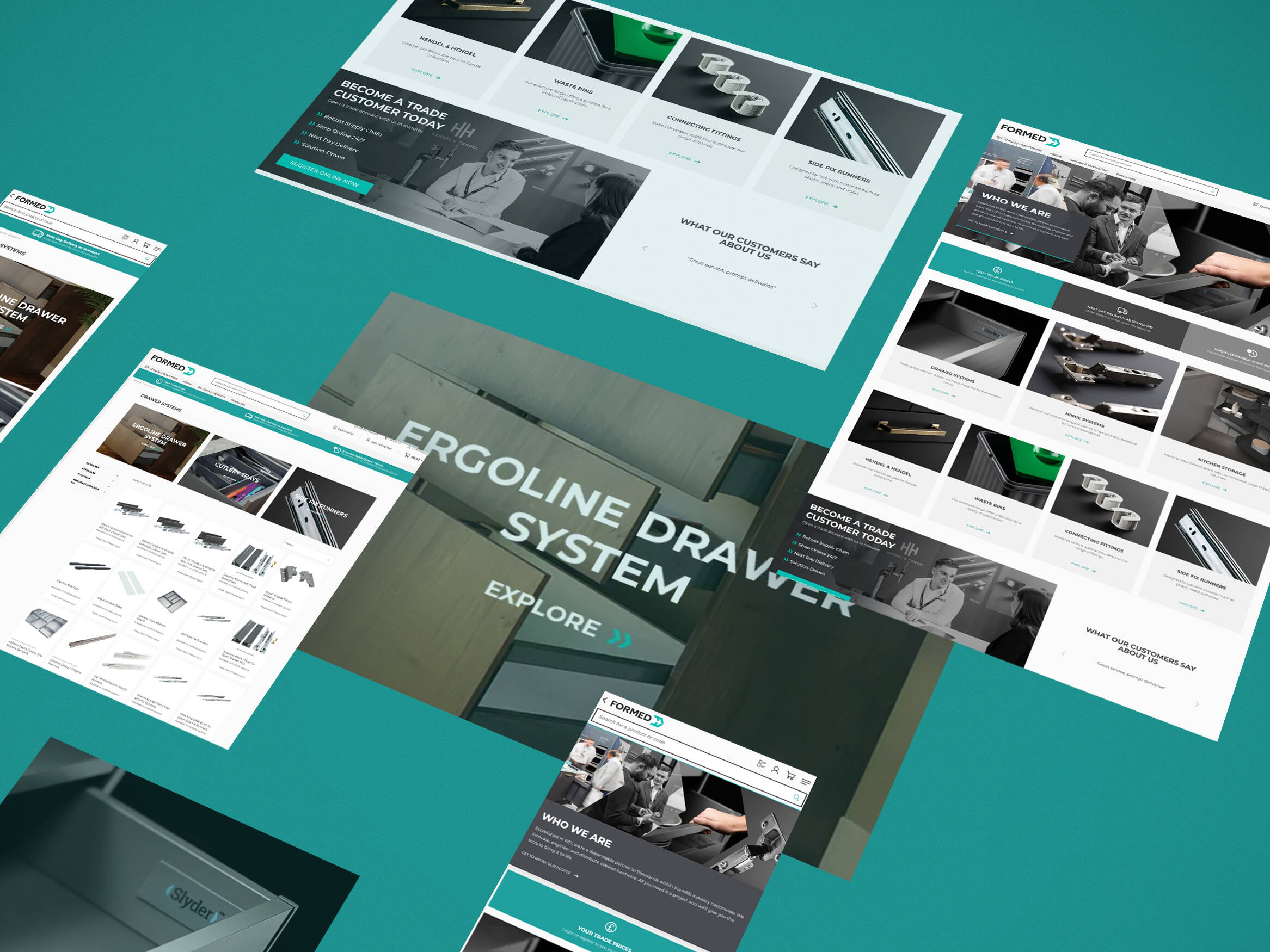
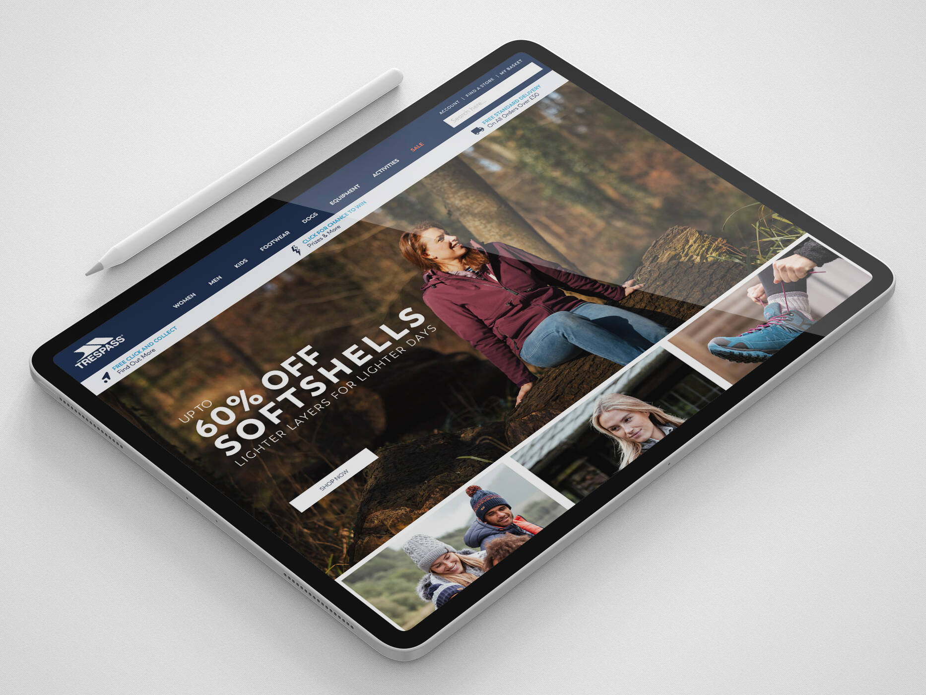
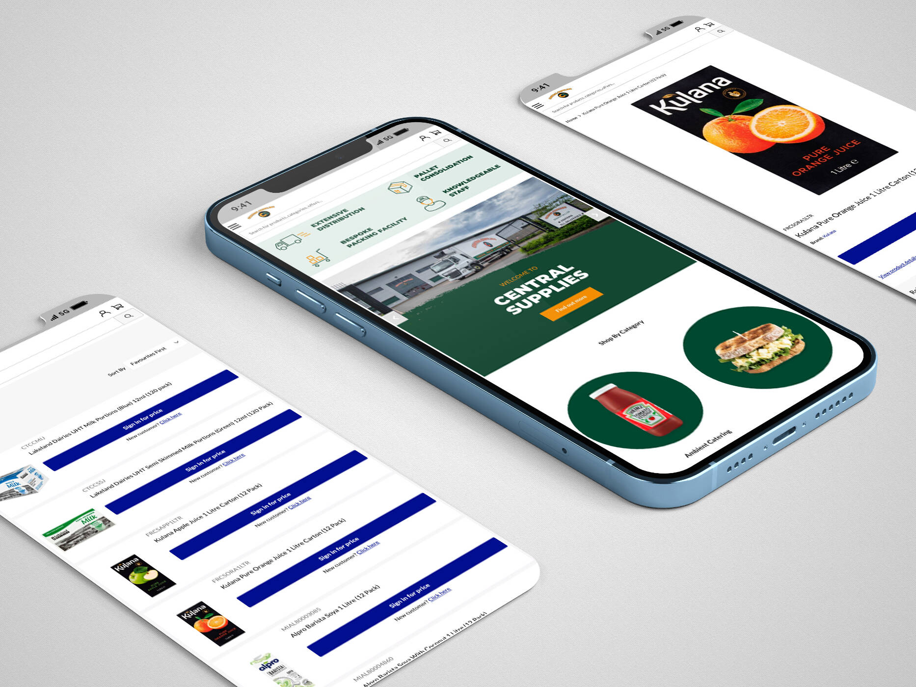
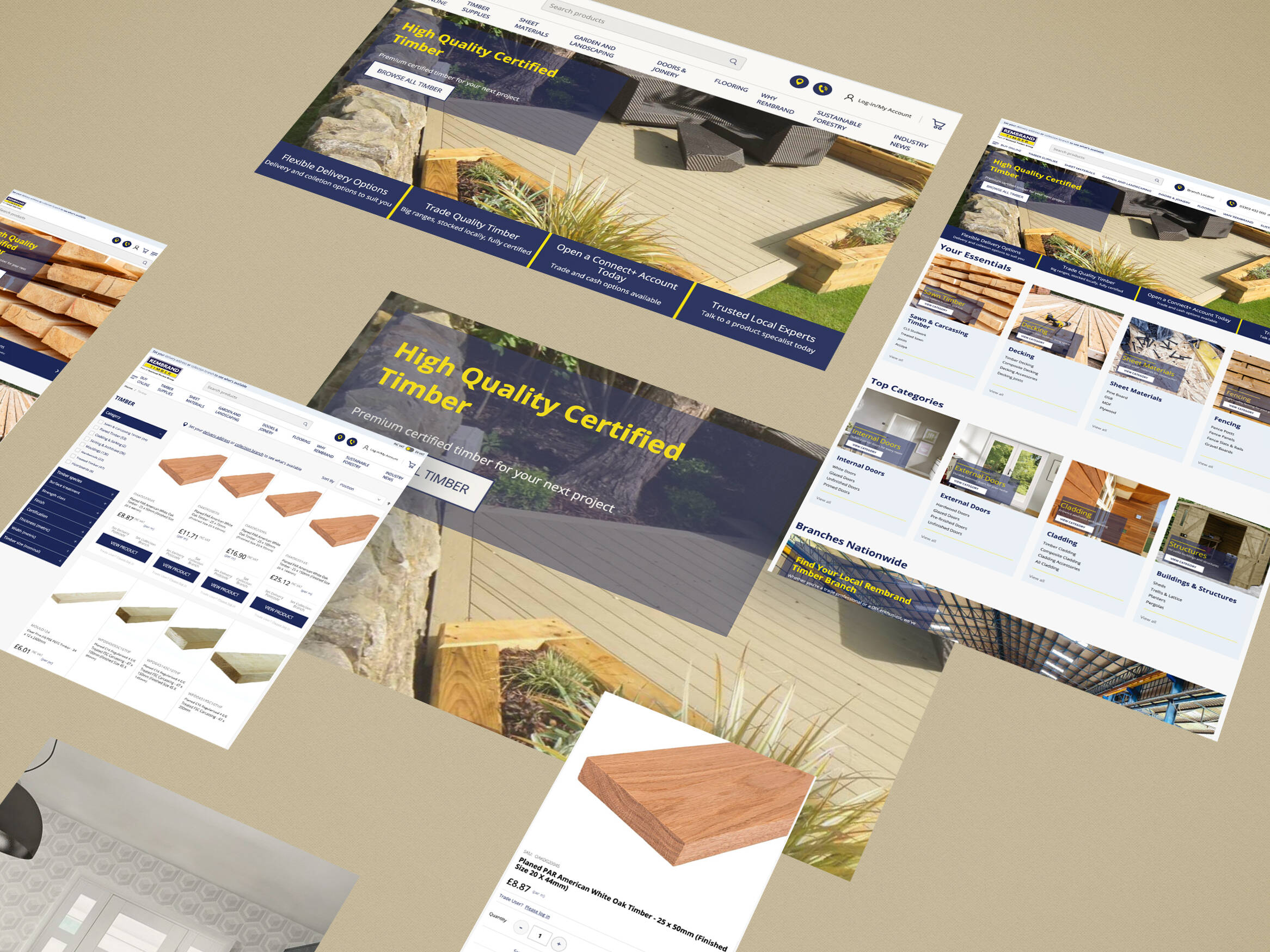
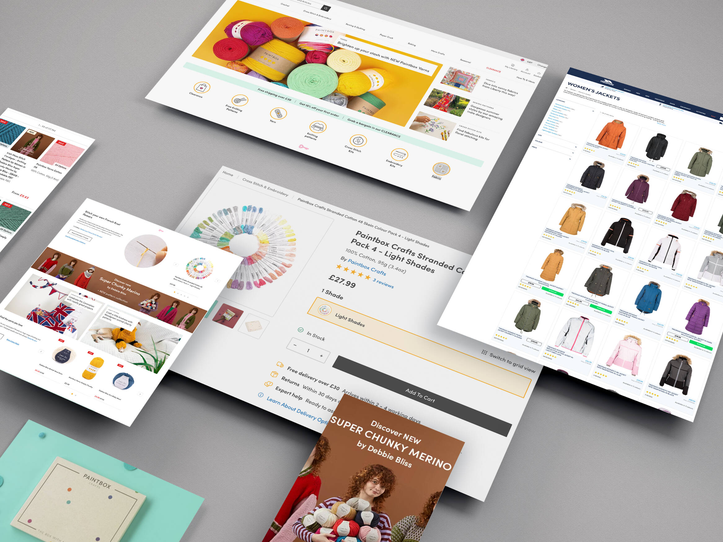
It’s so important that your online store works amazingly well on mobile, so you need to ensure you are following best practices. This is now the main device used by consumers to browse online, so you want to ensure that you’re making their shopping experience extra special.
One great term to remember is one of the oldest design mottos out there, “Form Follows Function”. Originally made infamous by the Bauhaus over 100 years ago, and it states that an objects primary function should be the main precursor to the design, over aesthetics, in digital terms. It’s still extremely relevant today.
When it comes to mobile, even though screen sizes have increased dramatically in recent years, there is still a lot less real estate here to play with when compared to its desktop counterpart. Therefore, it is important to get the most out of it as possible. This doesn’t mean you should cram lots onto the screen, people know to scroll so space your content out well.
AVOID – Pop-ups
These may be great at grabbing a users attention, but often they just become an annoyance. At this point, it might be worthwhile pointing out the difference between a pop up and a modal.
A modal can be very beneficial and help make the most of small screens. They require user action to activate it. So a button, when clicked, will open up a small window on the screen with extra information.
In contrast to this, a pop-up requires no direct interaction from the user. So they might not want it open and when it takes over the whole of the mobile screen, it will be more of a nuisance than helpful. The user is more likely to leave the site rather than continuing to purchase.
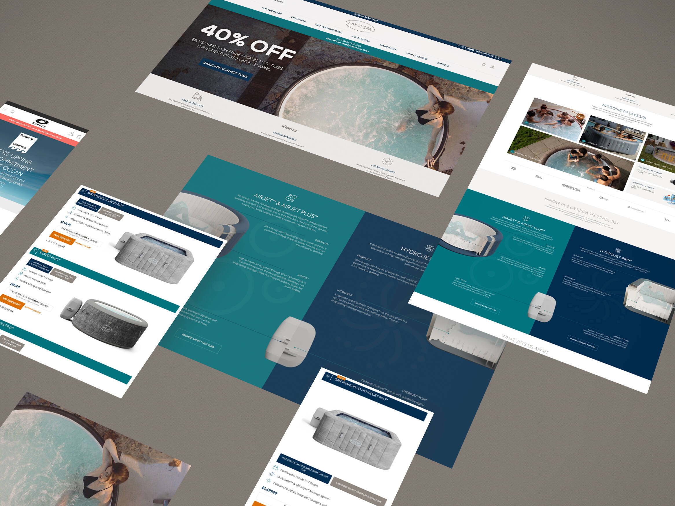
AVOID – Side-scrolling
When it comes to mobile, and desktop for that matter, it is best to implement a single direction for scrolling. By placing elements in a side-scrolling section you are effectively hiding options from the user.
This is also relevant to banner sliders, an area where many have done extensive research. Neilsen Group and Notre Dame University have found that only 1% of users interact with banner sliders. Timed carousels make this even worse as a user races to click on the call to action to find that they are then on a new slide.
“Only 1% of total visitors clicked through from the carousel, and the majority of these visitors (84%) interacted with only the first slide of the carousel.”
Notre Dame University
Take Away – Don’t hide important information from the screen.
AVOID – Hover effects
They don’t work on mobile, so make sure that the main indicator to an element being interactive isn’t relying on hover effects.
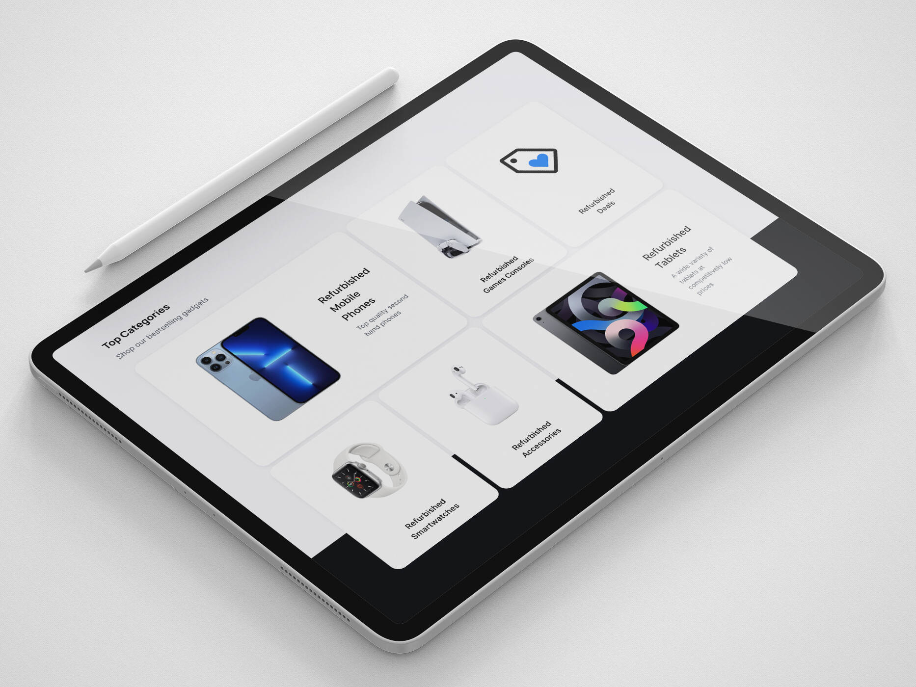
CONSIDER – Thumb sizes
When creating a call to action on mobile eCommerce sites, you need to make sure that it is accessible to all. Make sure that buttons are given plenty of space so that there is no accidental clicking of the wrong button. If your footer contains a lot of text links, try to give enough space for each link to be clicked.
CONSIDER – Use icons
When dealing with small screens, icon buttons can be a great way to save space. Replacing a list of options with illustrated counterparts can not only make your site more pleasing to the eye, but it will take up less space on the screen. This will also aid in site navigation.
Icons work well to break down language barriers, so it will help to improve the accessibility of your site. Dependant on the number of options needed, placing a row of options pinned to the bottom of the screen would help a site to mimic an app, which will also improve navigation. This also places all the main options within easy thumb reach at the bottom of the screen, allowing users to operate your site in a manner they are already familiar with.
CONSIDER – Scaling typography
It is very rare that you will require the same size type on a mobile screen as is required by the desktop counterpart. Therefore, your typography should scale through different device sizes.
You should consider how different devices are used, and the distance that the user is likely to be from the screen. Many of us will hold our mobile phones closer to our face than a laptop or monitor. By utilising this knowledge, we can use much smaller fonts on smaller screens.
If you would like to improve the usability of your mobile site, get in touch with us today.
Get in touch
We know commerce, let us help you improve customer experience, increase conversion rates, and make that digital change.
- hello@iweb.co.uk